http://www.caandesign.com/highgate-by-tg-studio/
Highgate by TG Studio
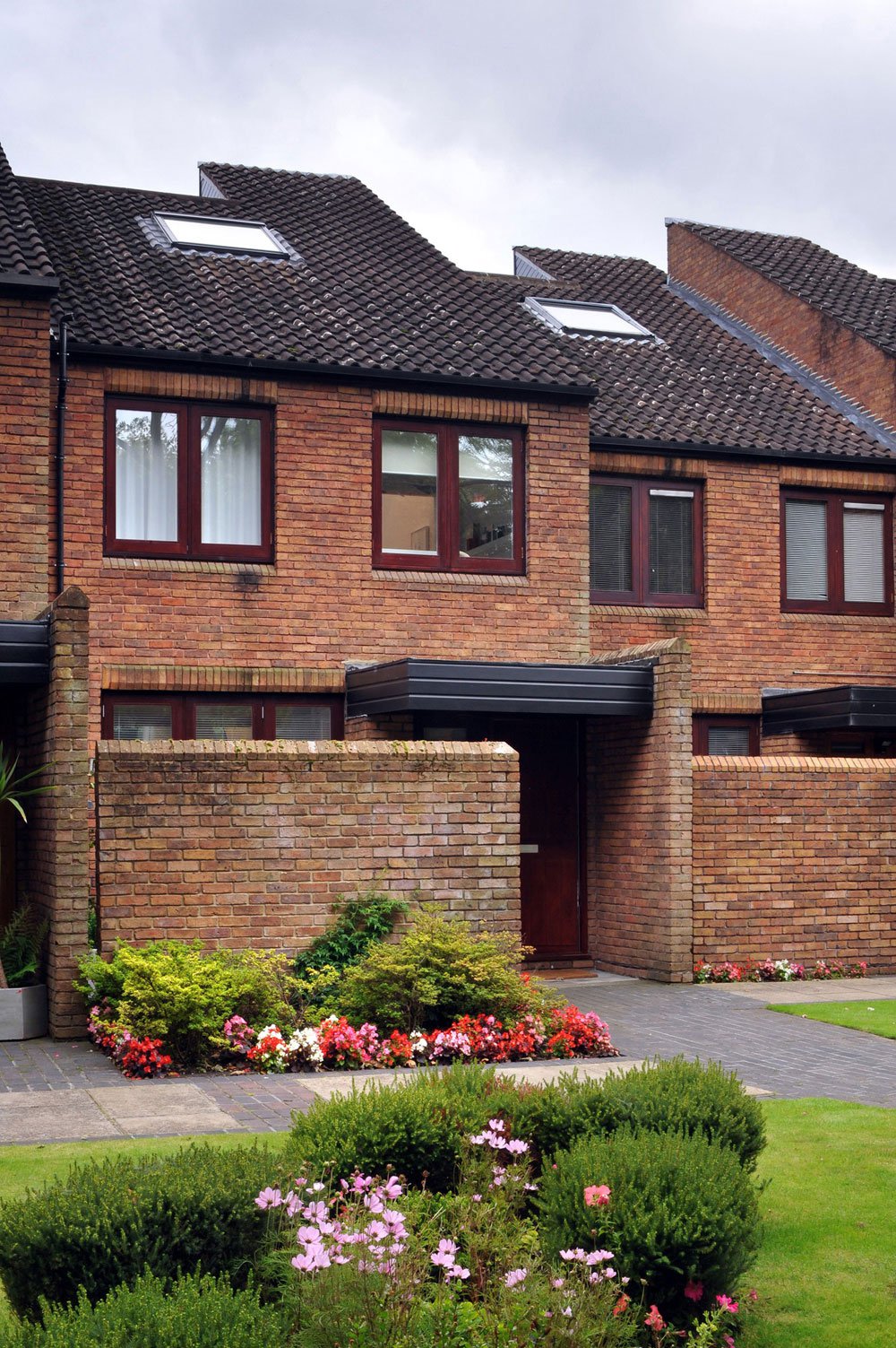
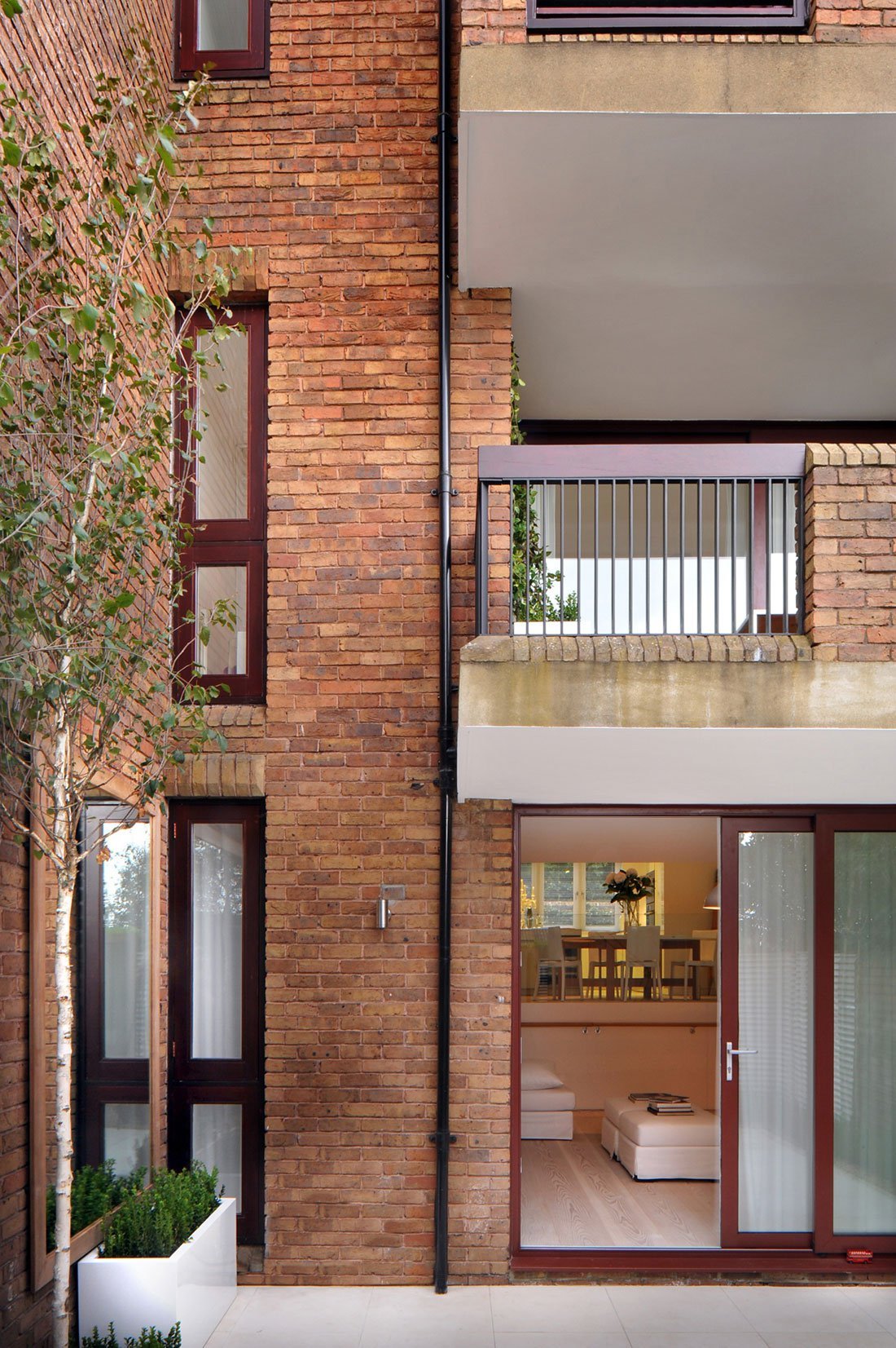
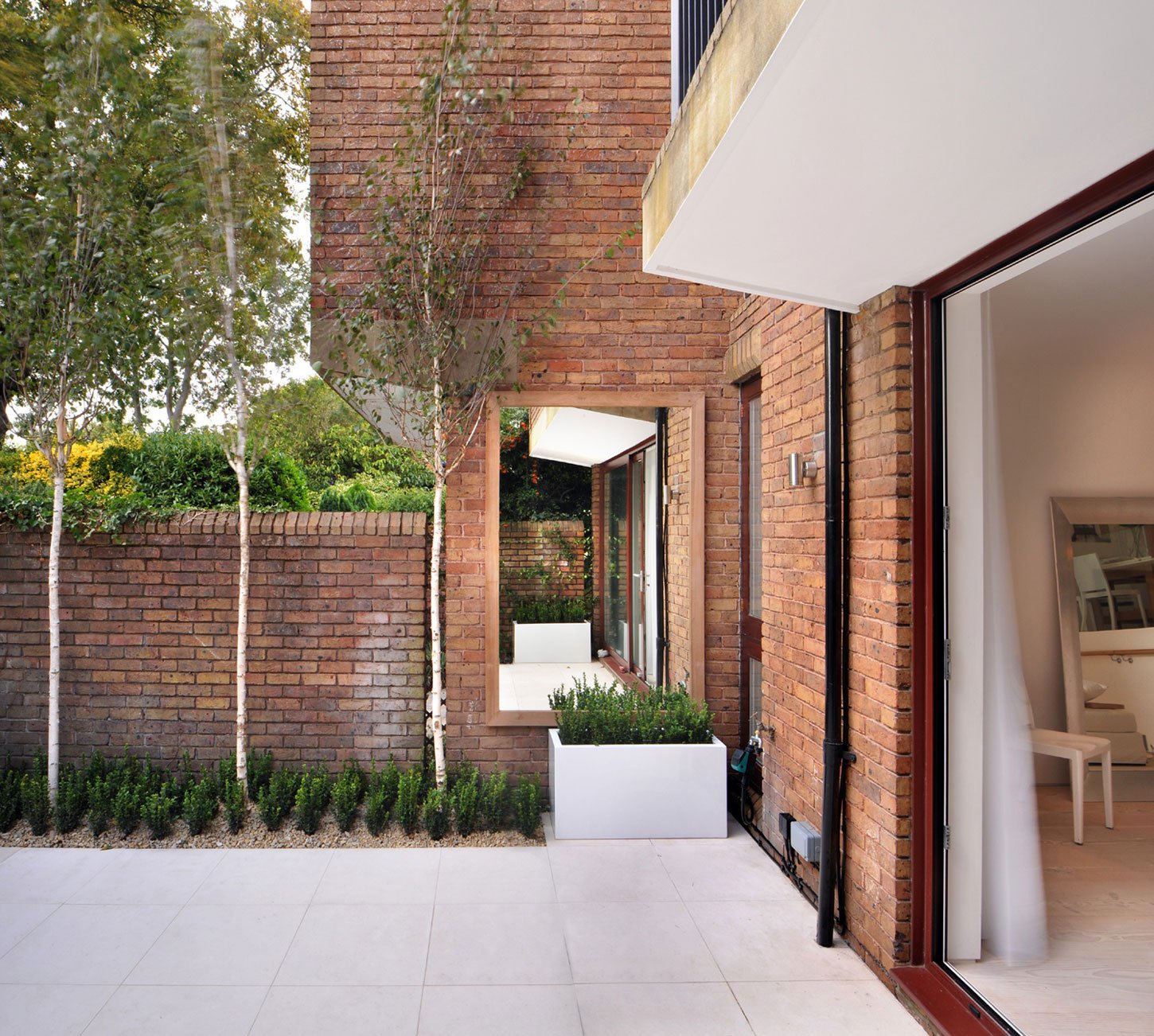
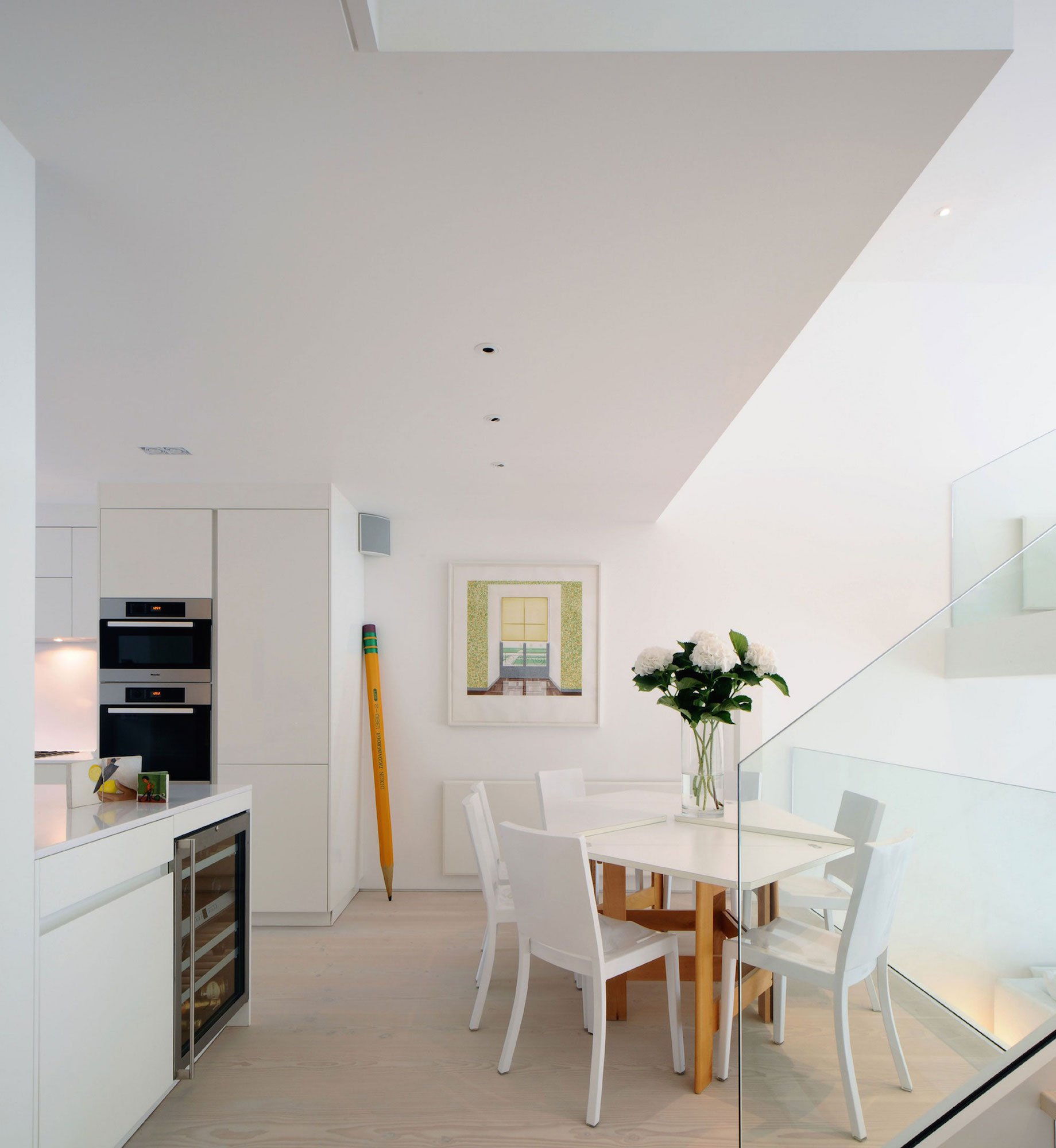
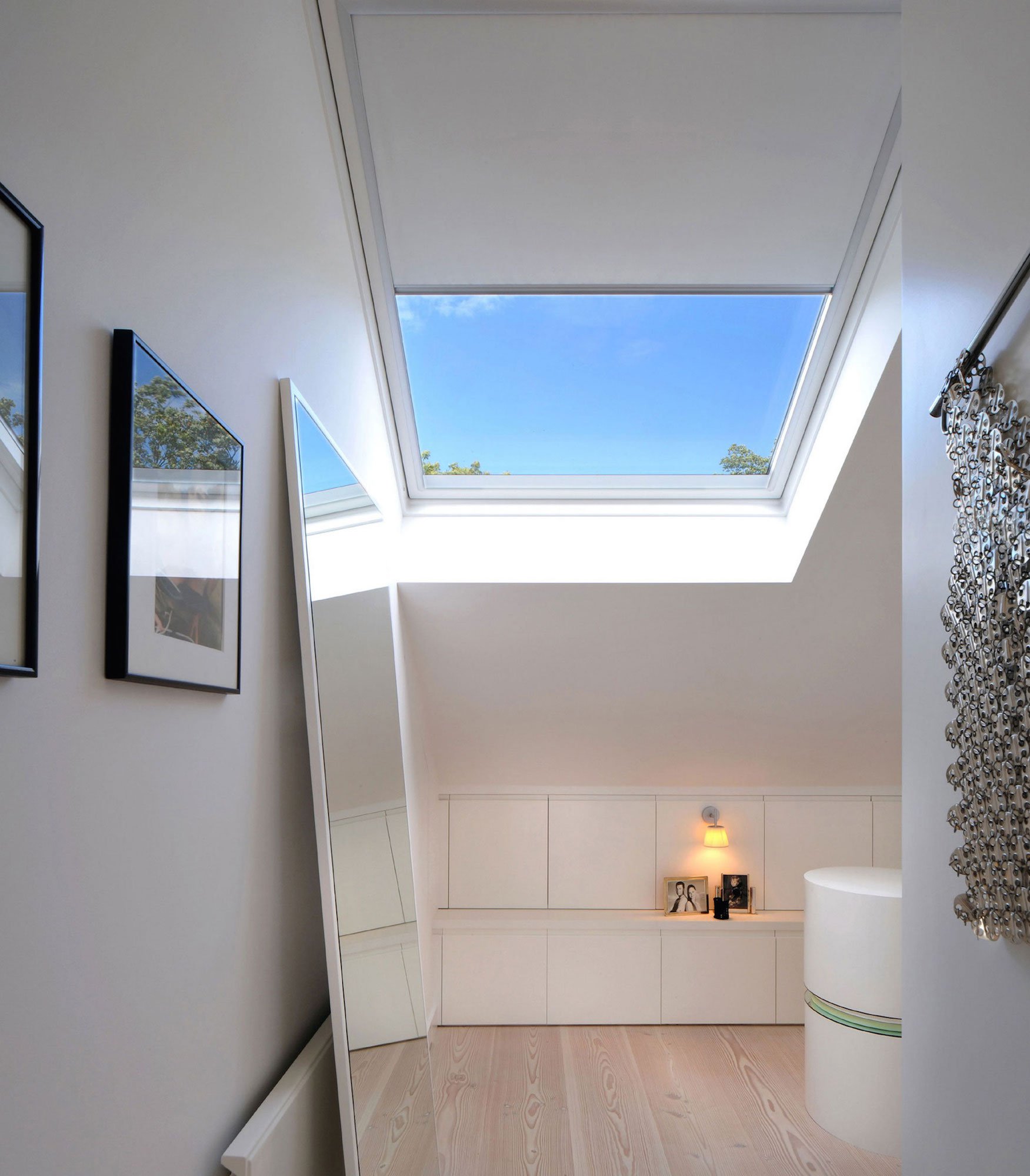
This modern terraced house on a private estate in North London has been completely transformed – from dark and soulless into an oasis of cool, calm and contemporary. Thomas Griem, Design Director of TG Studio, with architecture and design offices in London, has designed a beautiful home by entirely re-organising the internal layout to let natural light flow through every corner of the house.
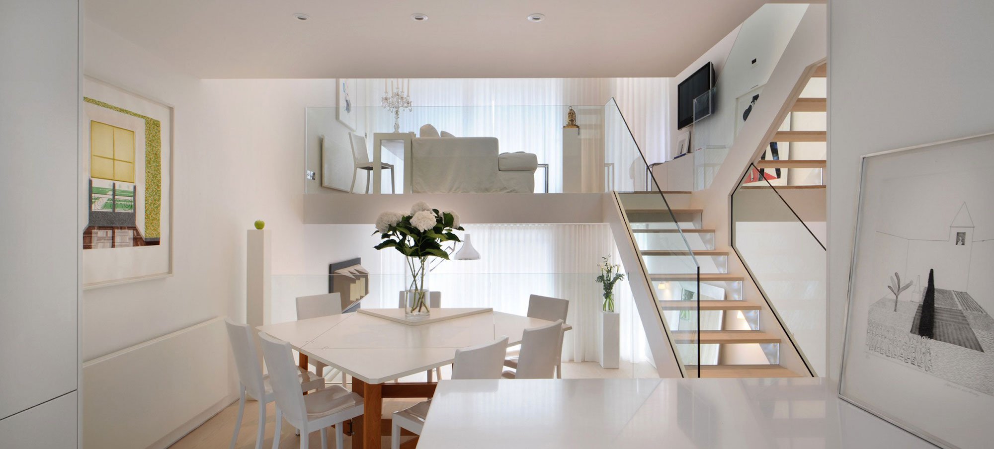
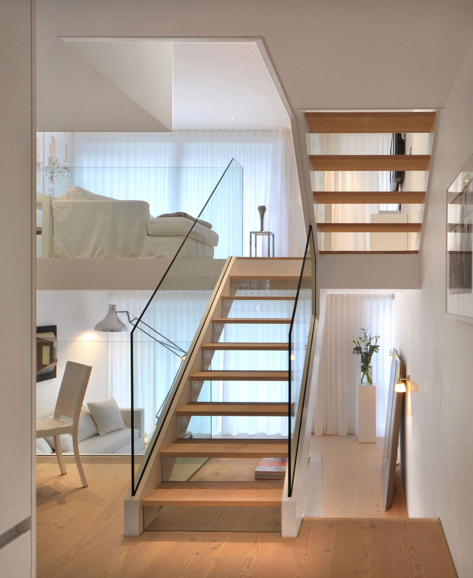
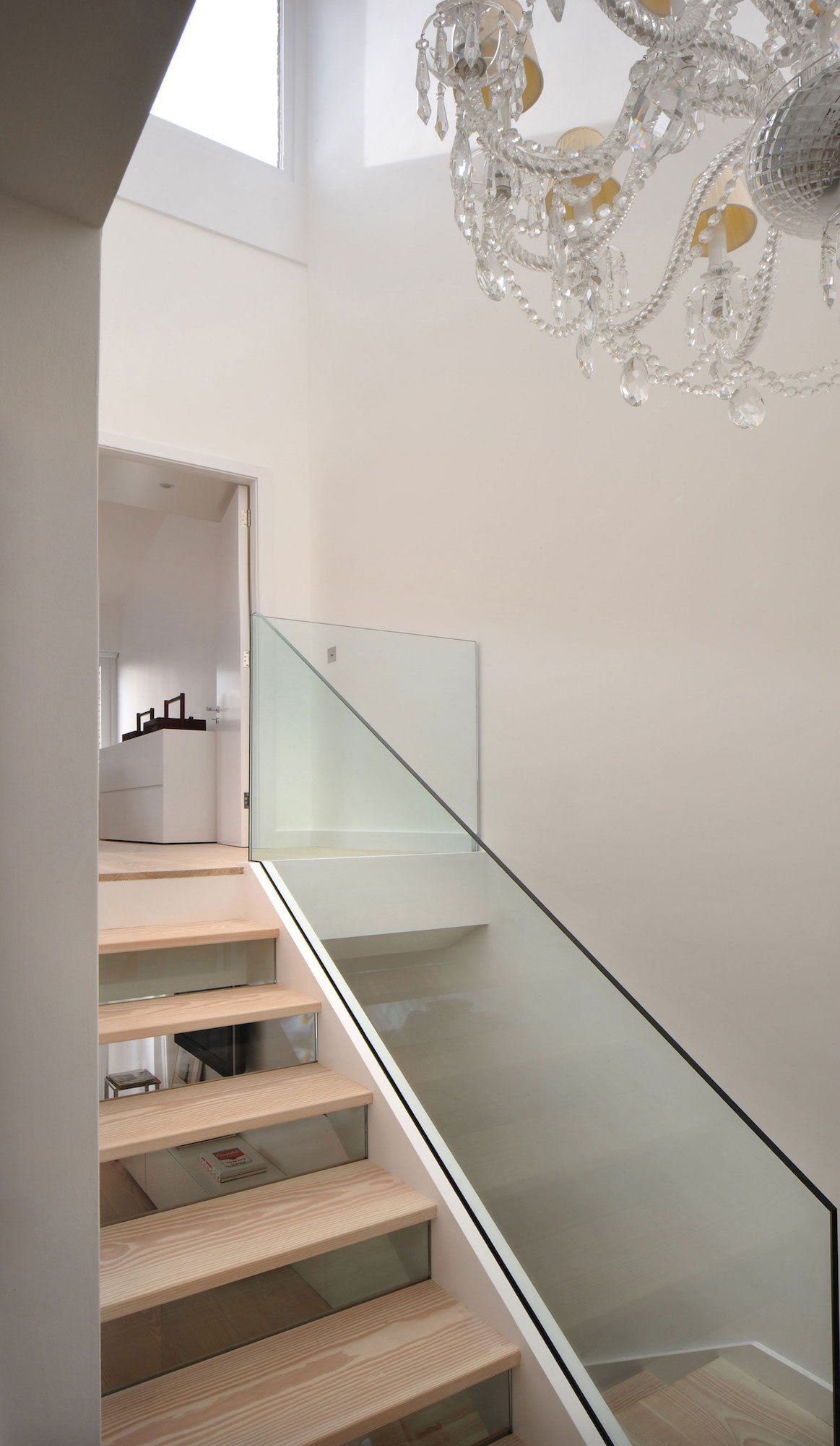
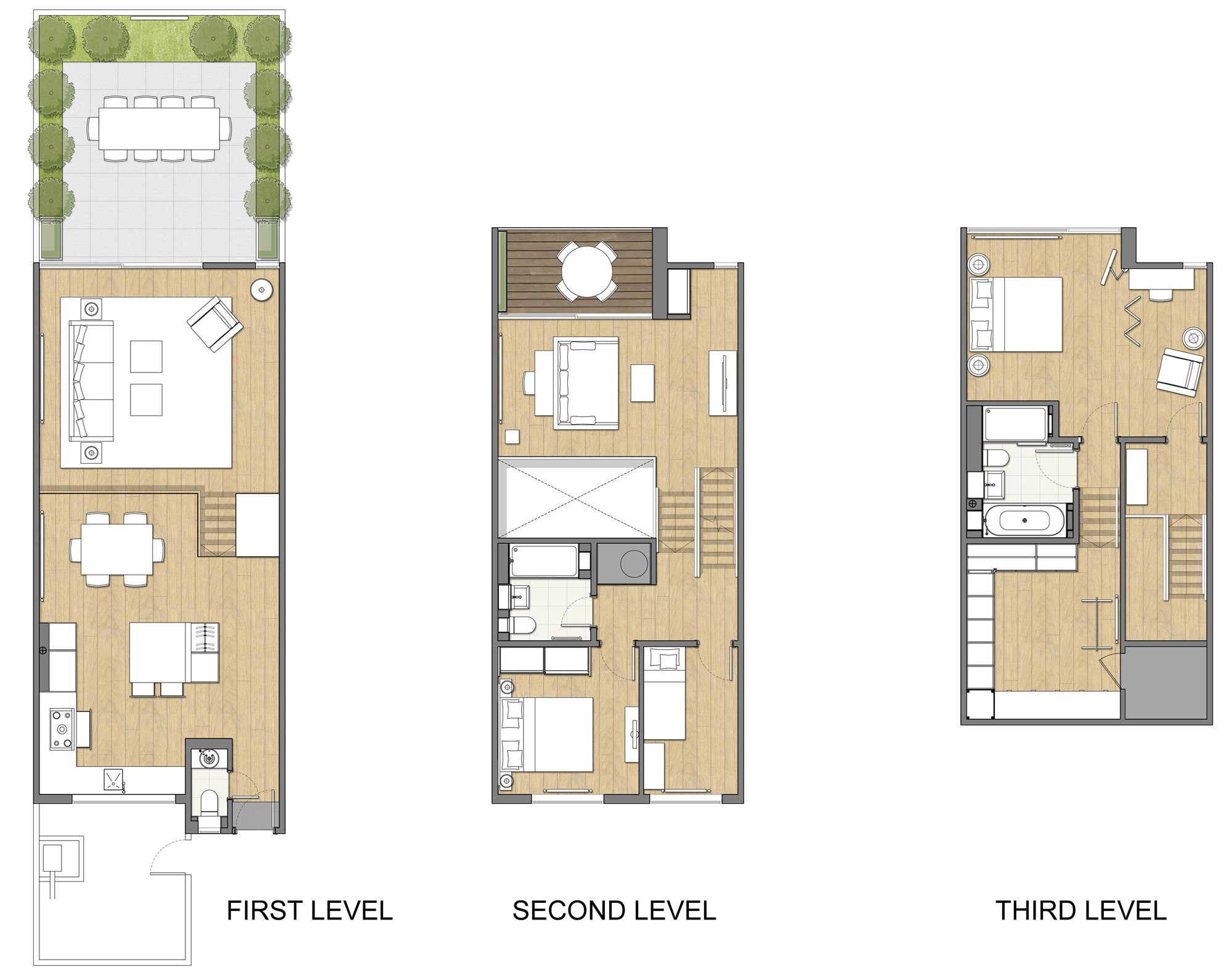
Thomas tackled the brief to create a light and bright space and make the most of the unusual layout by designing a new central staircase, which links the six half-levels of the building.
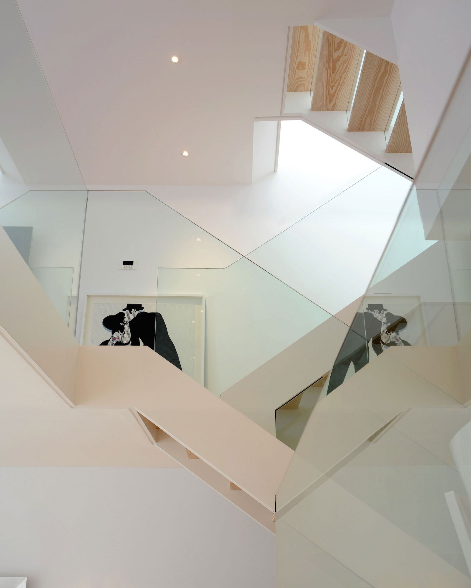
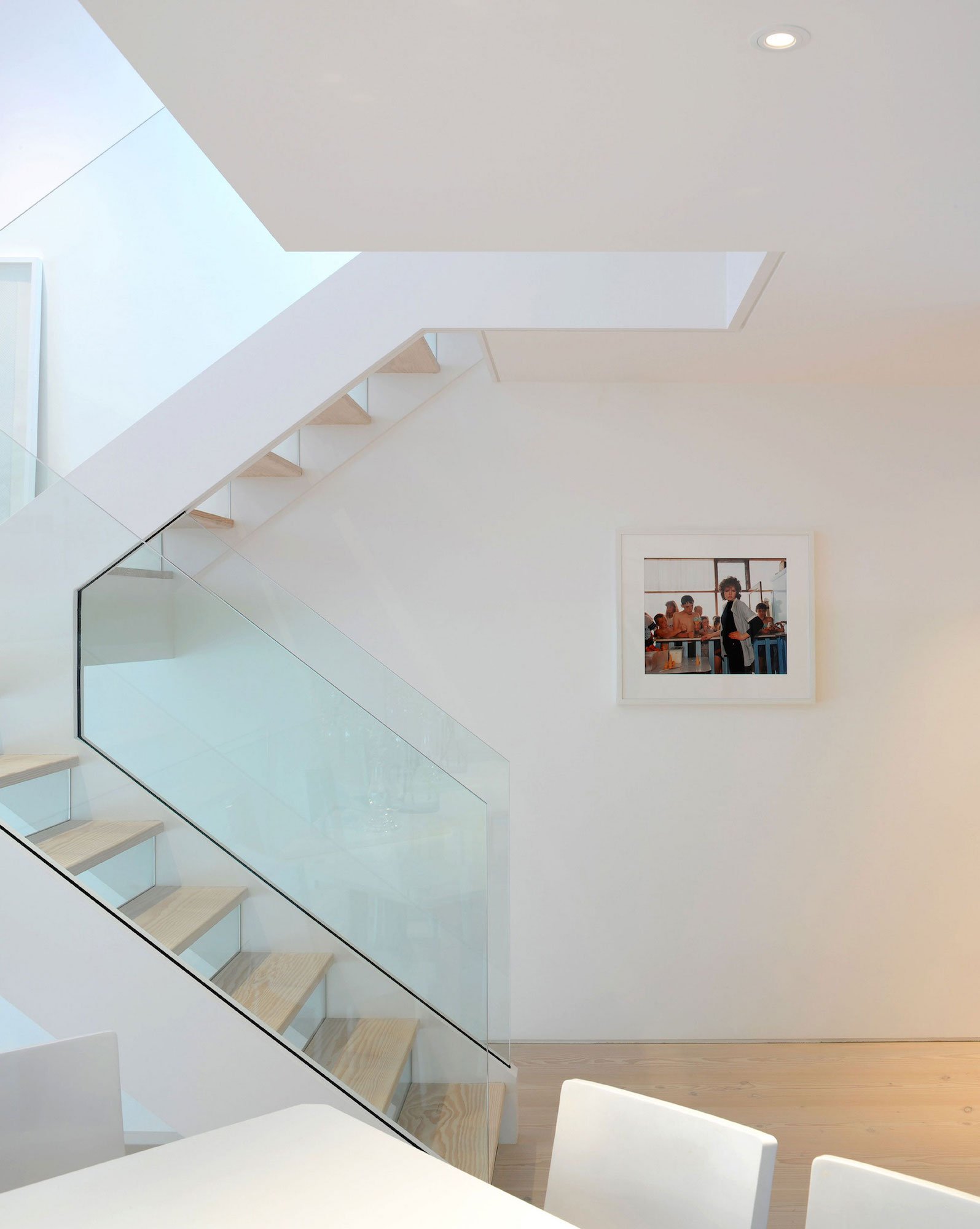
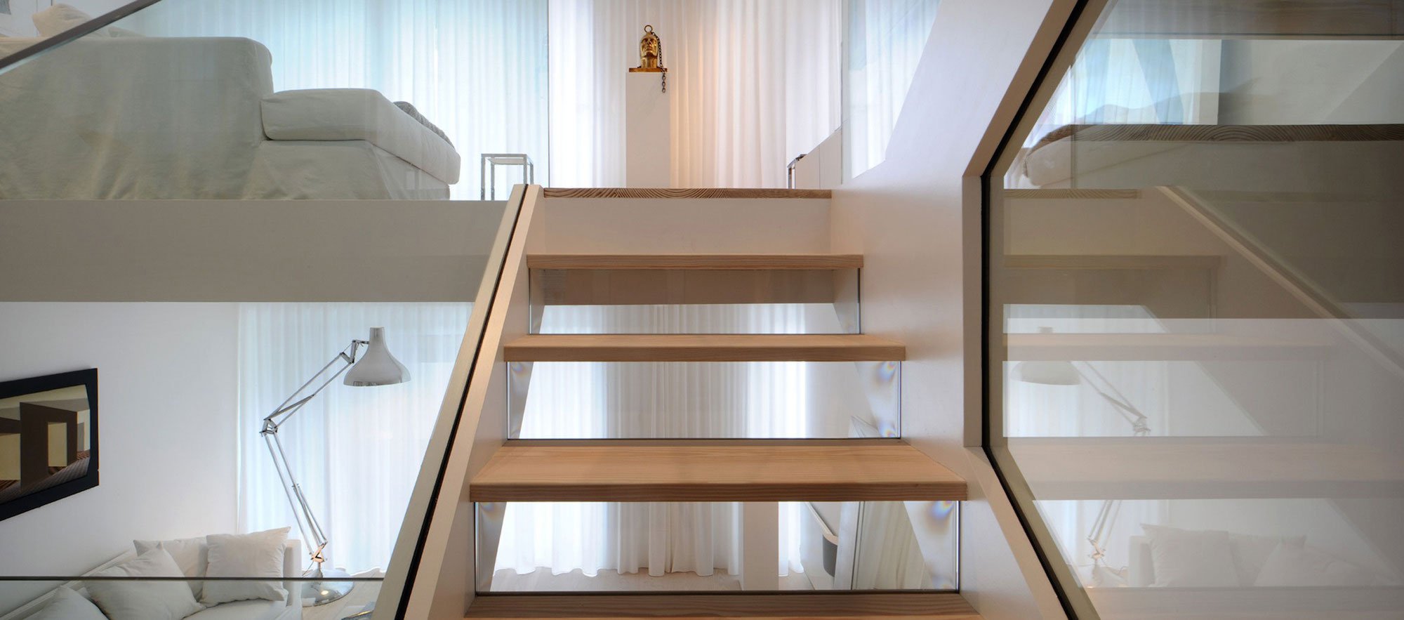
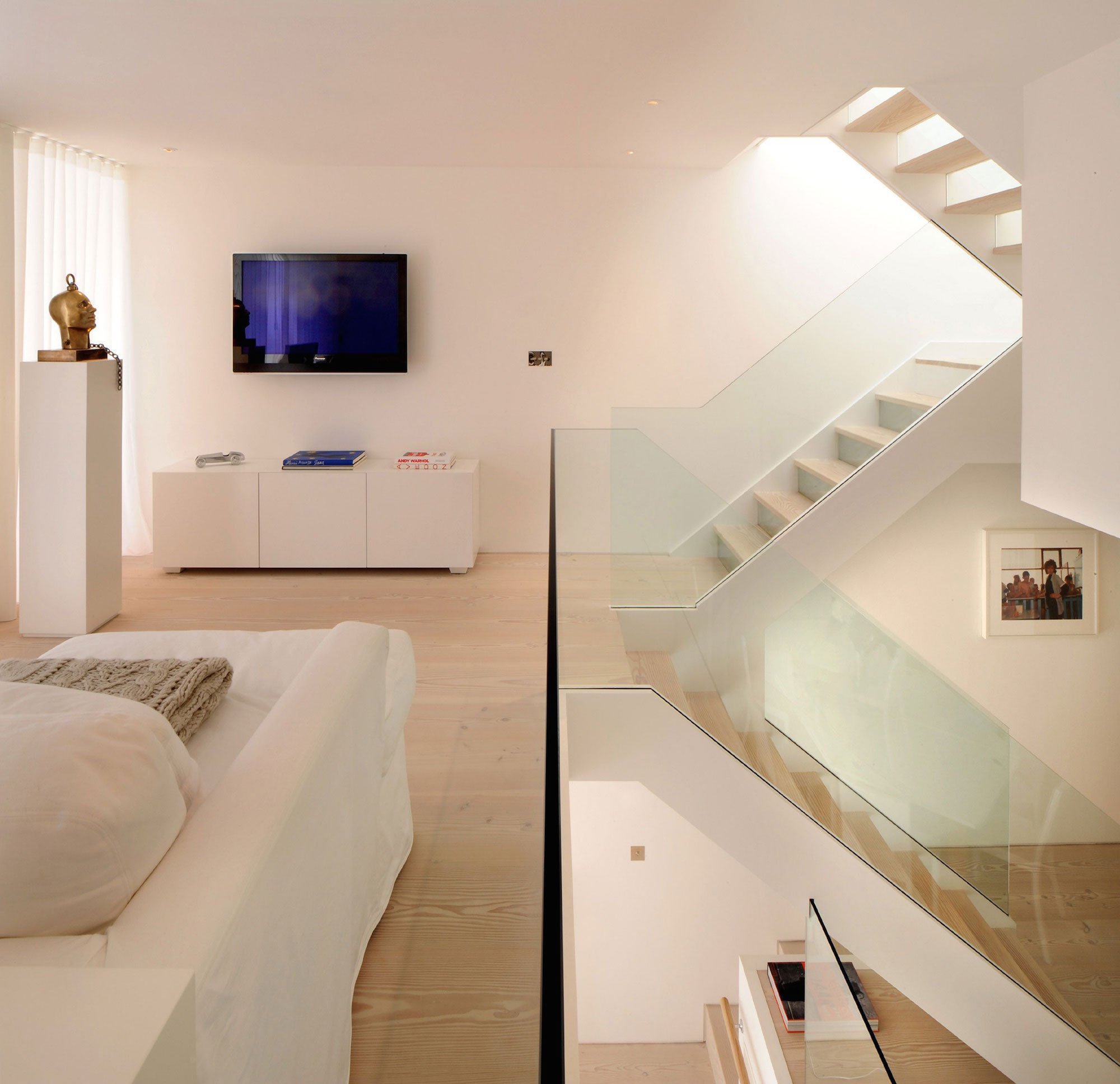
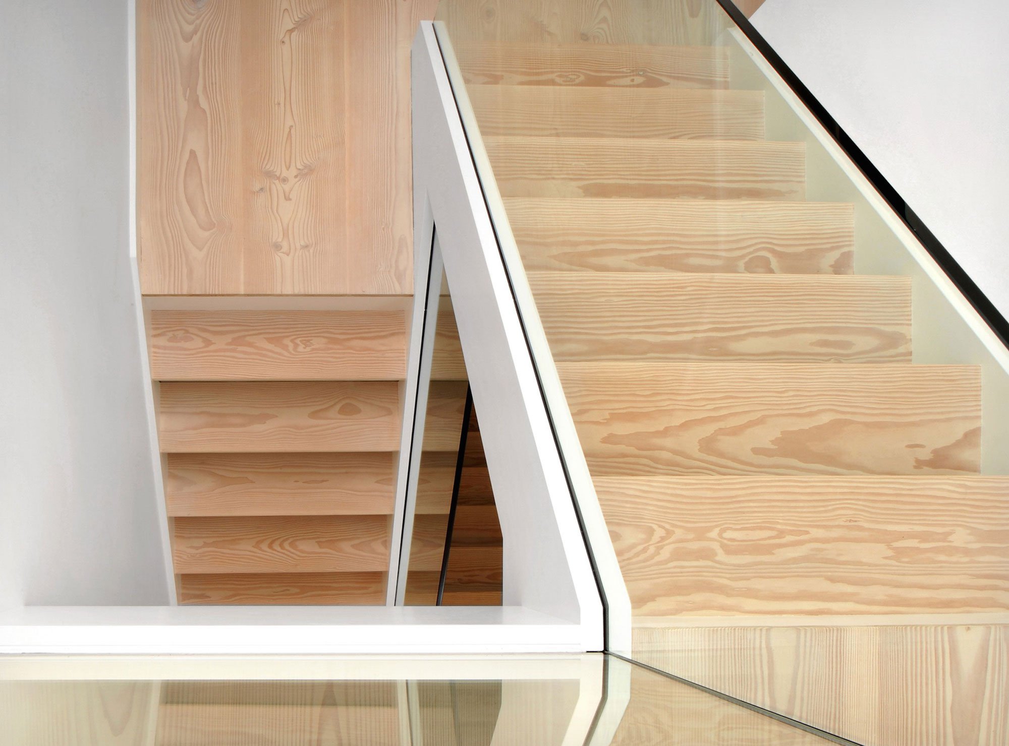
A minimalist design with glass balustrades and pale wood treads connects the upper three floors consisting of three bedrooms and two bathrooms with the lower floors dedicated to living, cooking and dining. The staircase was designed as a focal point, one you see from every room in the house. It’s clean, angular lines add a sculptural element, set off by the minimalist interior of the house.
Advertisement
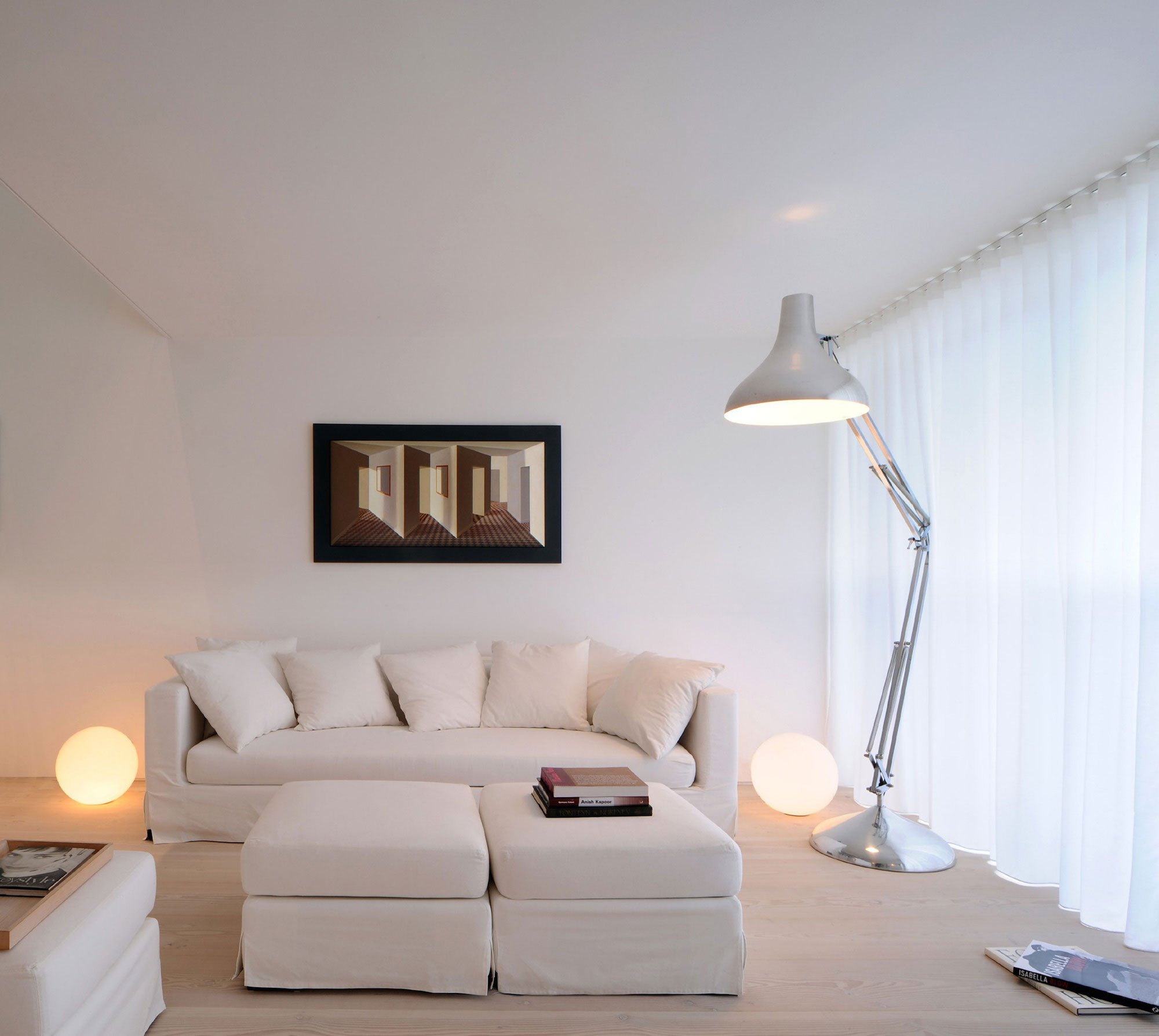
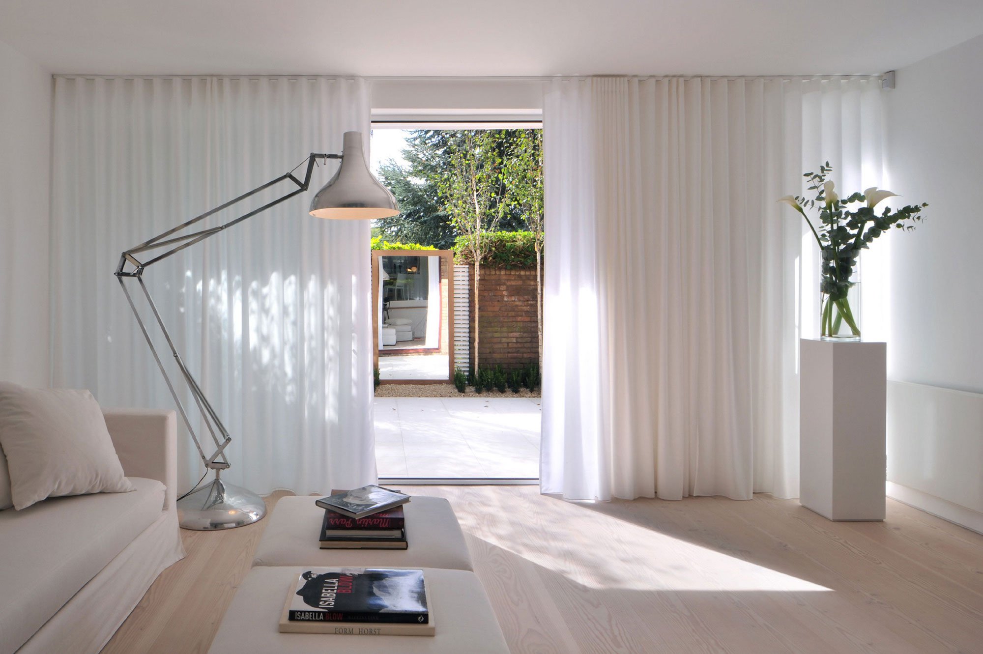
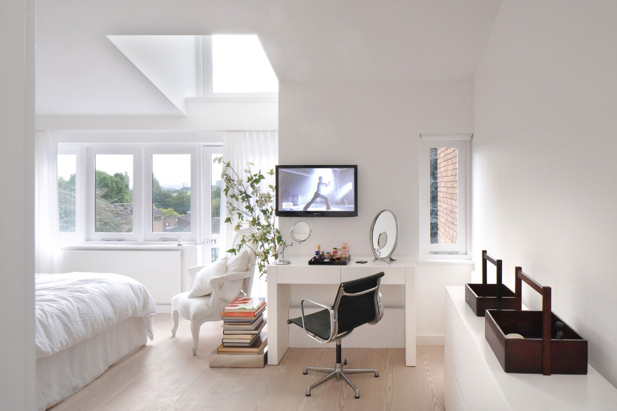
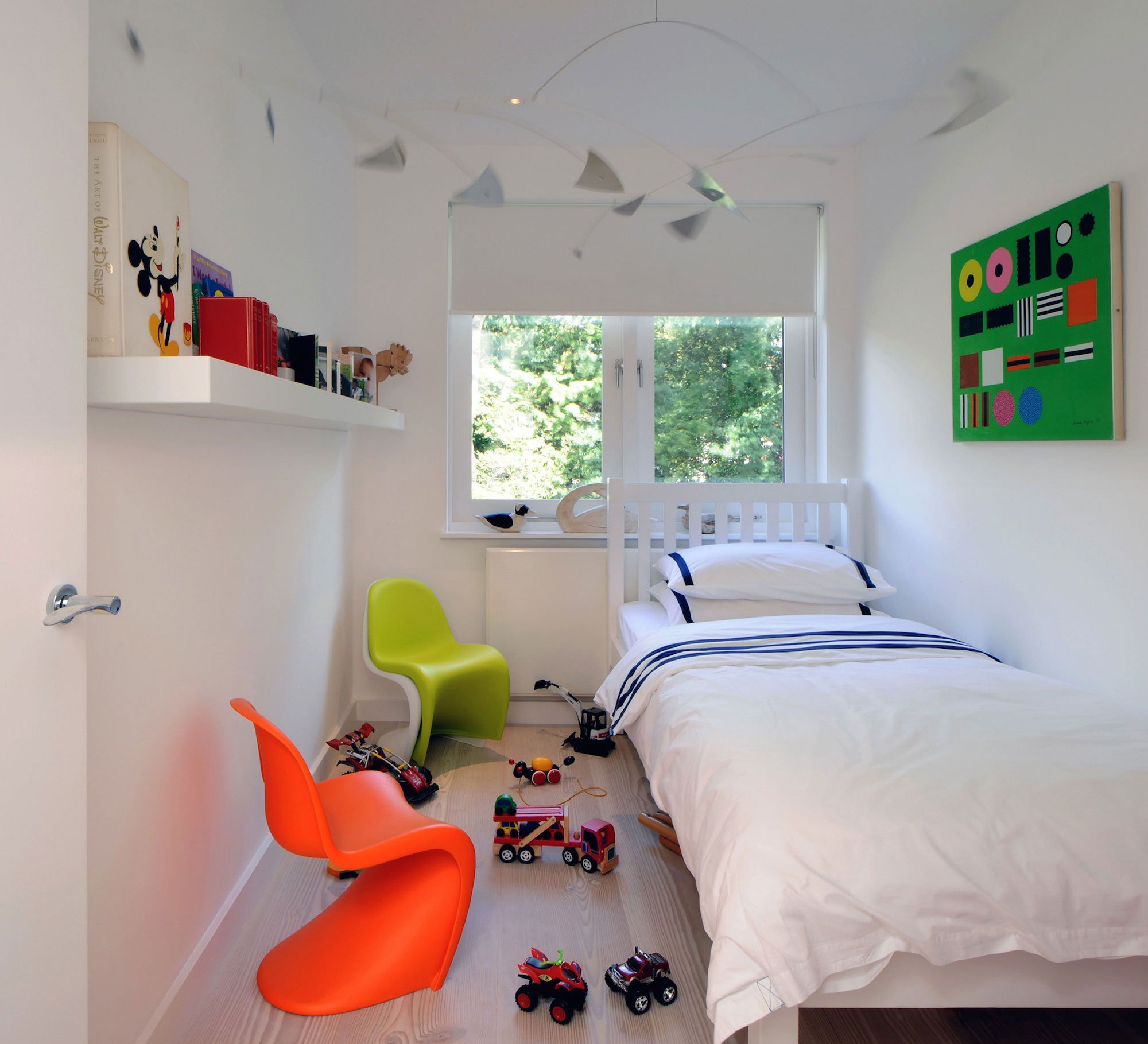
The use of glass allows natural light to flood the whole house, a feature that was central to the brief of the Norwegian owner. The owner’s Scandinavian roots are echoed in every aspect of the design with exclusively white walls and ceilings and white pigmented pine floors as a backdrop to furniture, furnishings and accessories in natural materials such as linen, pale wood, glass and stone, all in white and neutral colours.
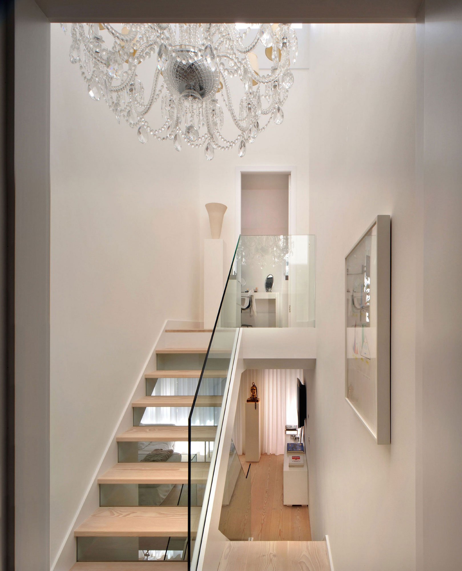
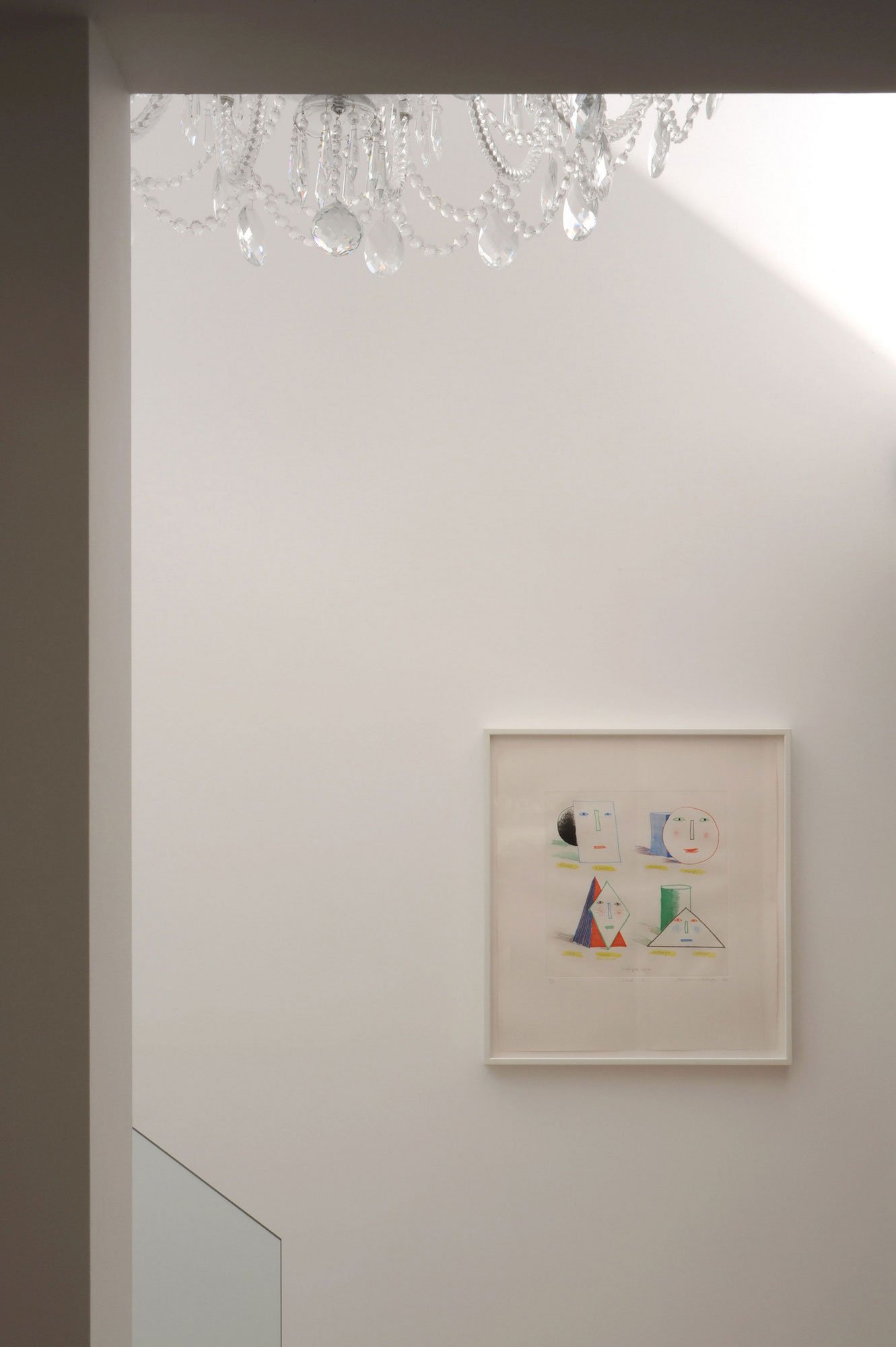
The top floor has an impressive six metre ceiling height where a huge chandelier in hand-made crystal glass makes a wonderful play of light on the walls. The drama of the chandelier as well as the owner’s collection of modern art displayed throughout adds personality and wit to perfectly finish a very successful transformation.
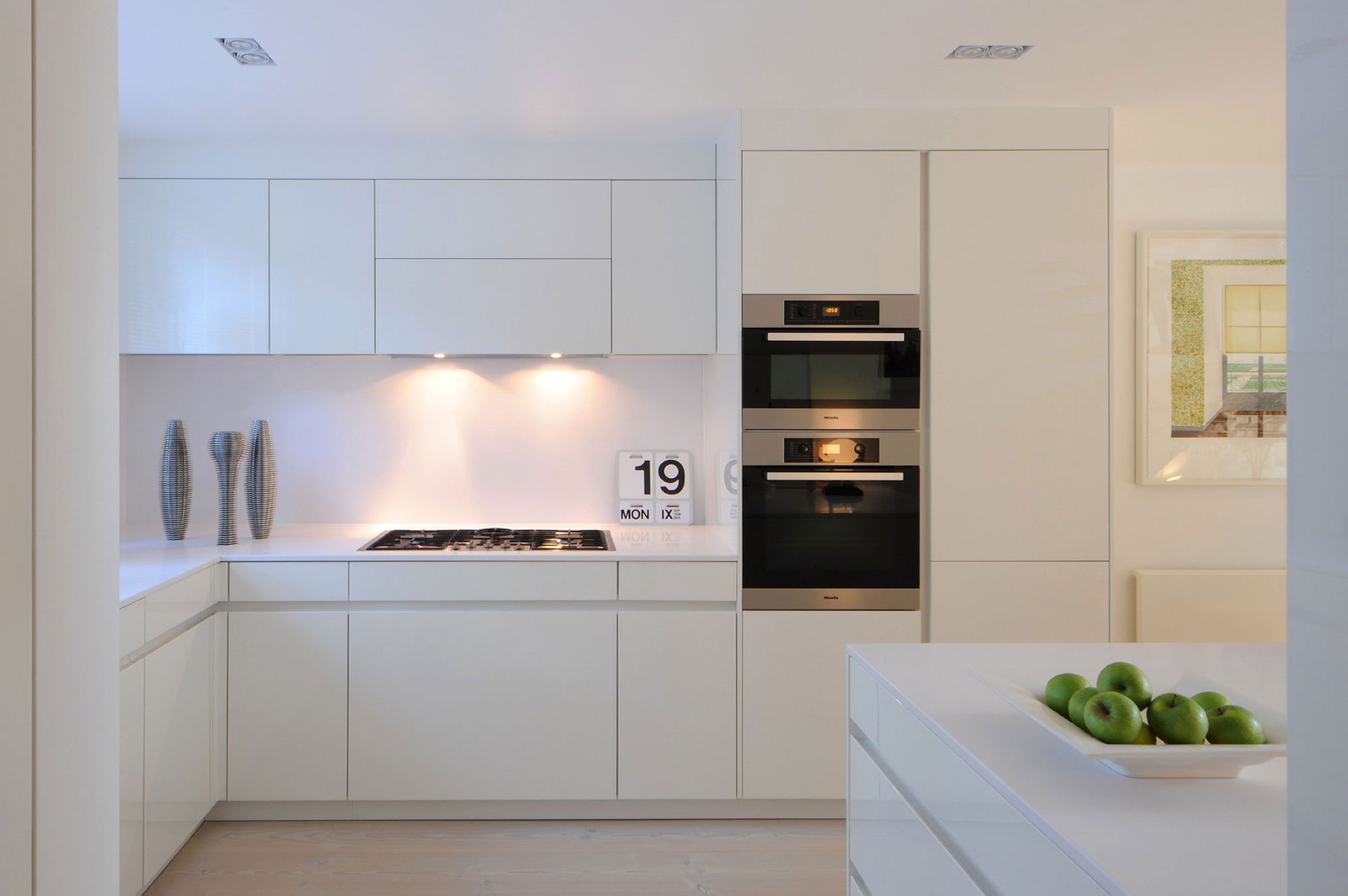
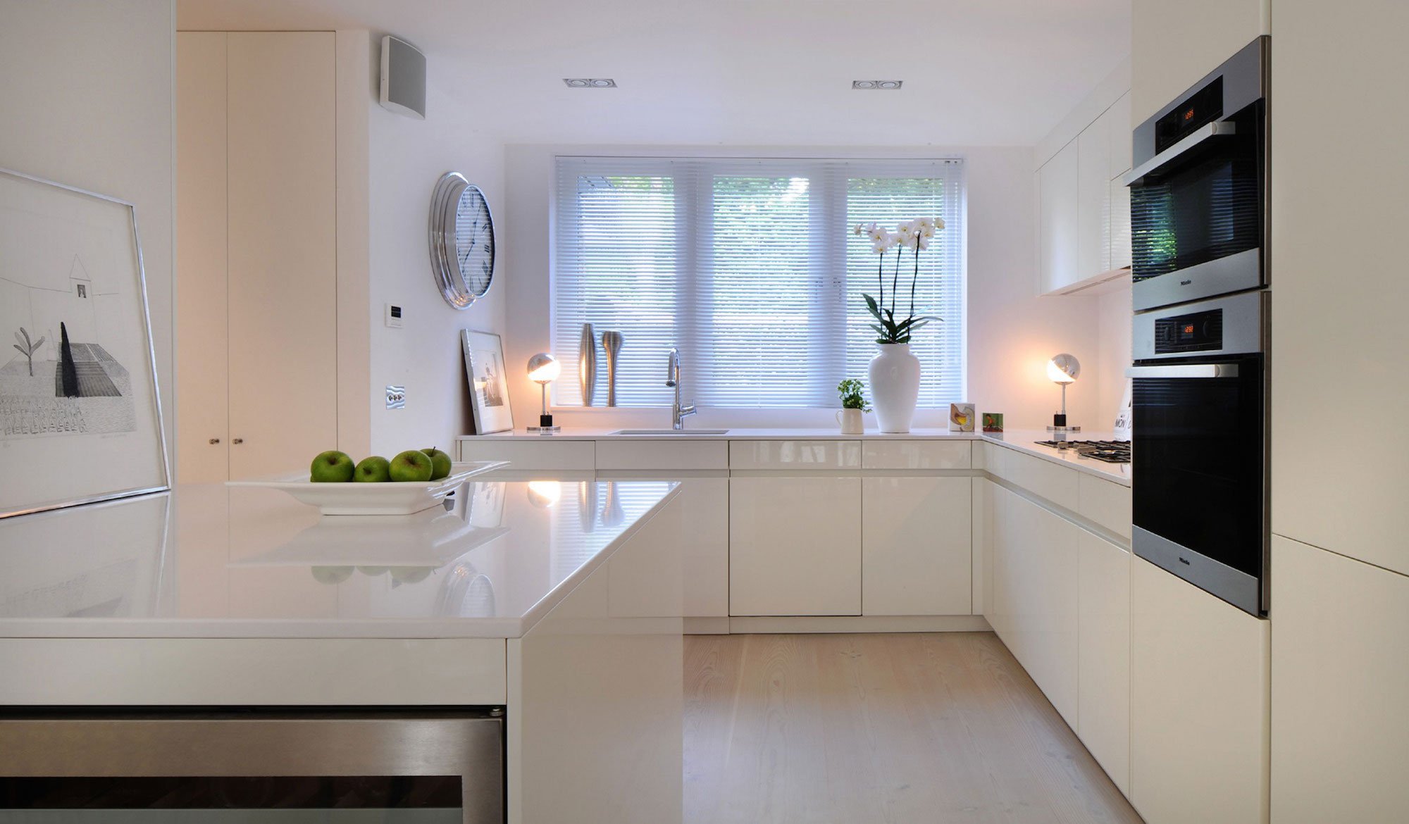
Comments Thomas Griem, “To create a minimalist interior without it appearing cold and impersonal is difficult and relies on a very well executed layout, selection of finishes and ample storage!. When only one non-colour is allowed (white) the depth of the design can only be reflected to the viewer by the surface of the materials. It is the hardest thing to do.
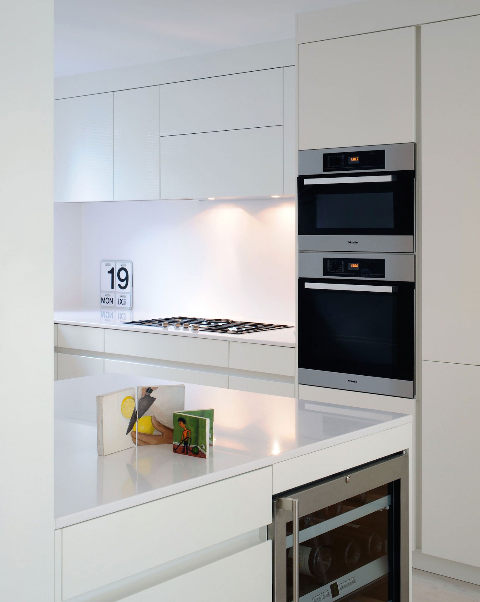
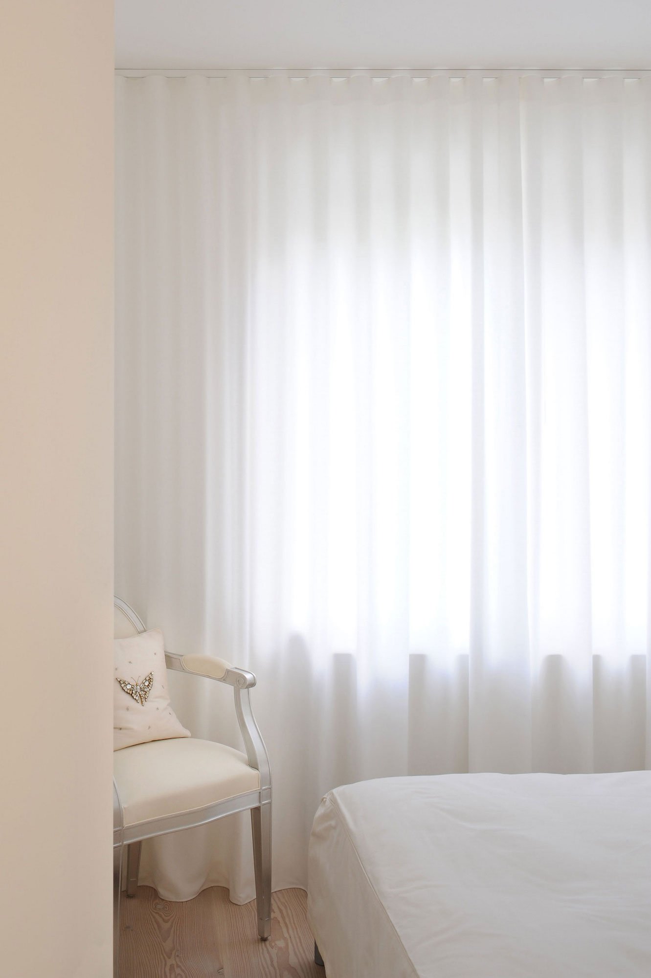
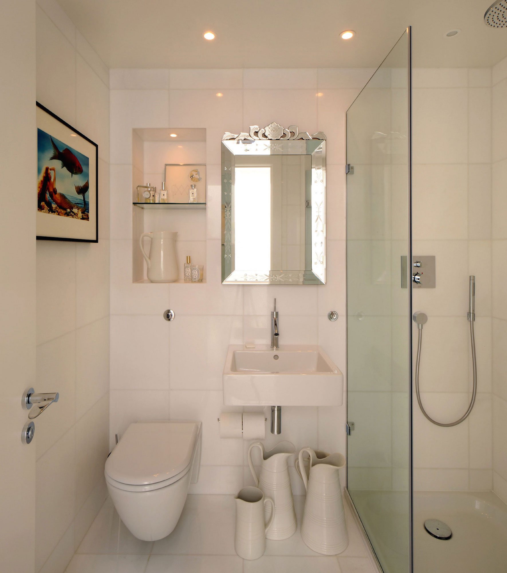
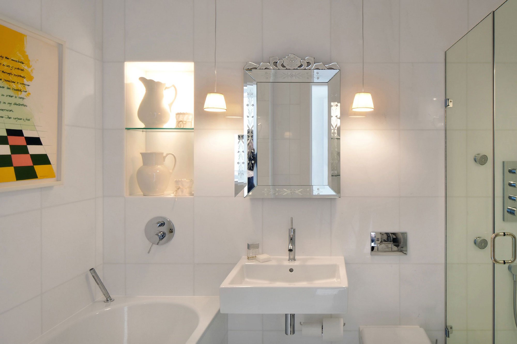
In this project we used matt white wall colour, reflective white stone and kitchen units, soft and organic white stained wood floor boards, soft white linen and see- through cloudy white curtain fabric.
Thank you for reading this article!
沒有留言:
張貼留言