http://www.caandesign.com/transformation-spaces-rethink-home-clean-minimalistic-environment/
Transformation of the spaces and rethink the home for a clean minimalistic environment
Architects: Shachar Rozenfeld
Location: Ramat HaSharon, Israel
Year: 2016
Area: 3.229 ft²/ 300 m²
Photo courtesy: Shachar Rozenfeld
Description:
Location: Ramat HaSharon, Israel
Year: 2016
Area: 3.229 ft²/ 300 m²
Photo courtesy: Shachar Rozenfeld
Description:
“This 300 sqm. home renovation in Ramat-Hasharon reflects the change in the homeowners’ status in life and the number of occupants the home was originally planned for.
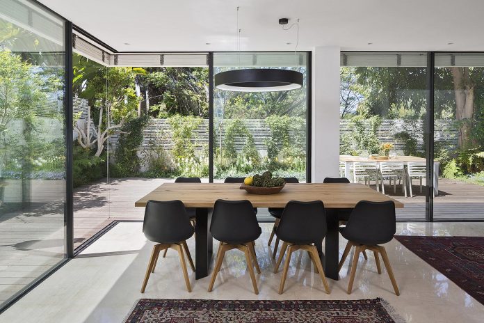
The design approach was to transform the spaces, that once served a family, into a clean minimalistic environment, that will suit the parents today, infuse it with a more contemporary touch and serve as a personal gallery to display their photographs.
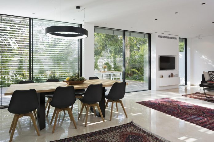
The house has five levels and was built on a 250 sqm. plot in the 1980s’ as part of a four-house complex.
Advertisement
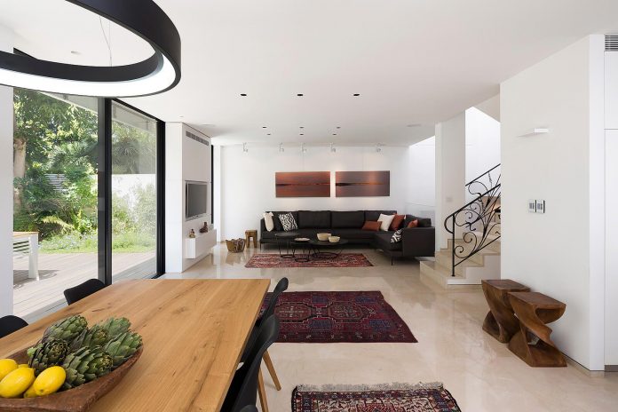
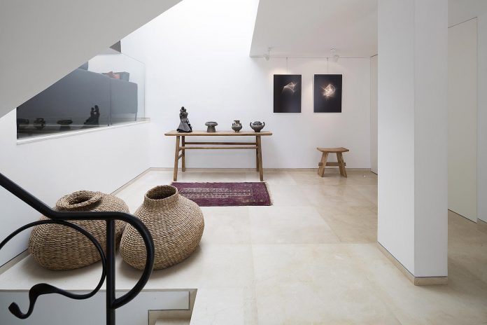
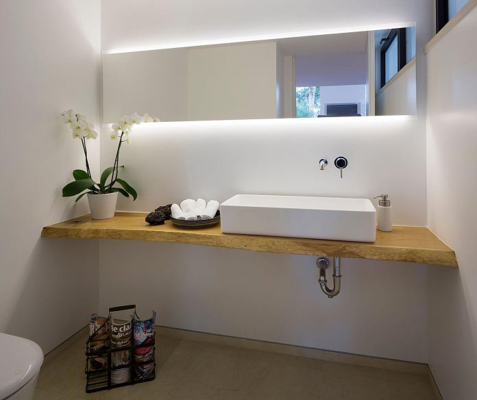
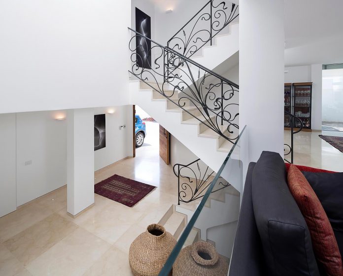
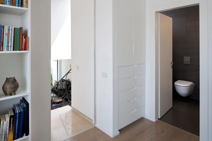
The first change you will notice when you walk through the main entrance is the reallocation of space in the entryway. By removing as many of the walls as possible, integrating the inner patio and moving the powder room, a more open and welcoming experience was created in which the couple can showcase their art as a prelude to the spaces to come.
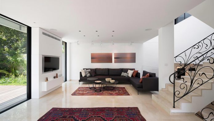
A glass banister was put in place of the bent steel baluster that separated the seating area and the entryway, to create a clearer bond between the two. Furthermore it hints at the upcoming space, creates visual contact with the main seating area and further enhances the openness of the space.
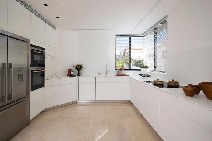
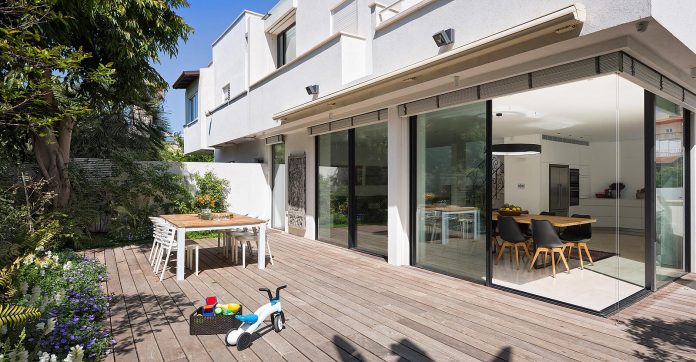
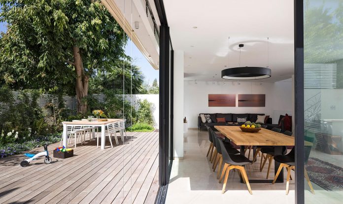
The main living space, situated half a level above the entryway, includes an open kitchen, a seating area and a large dining table. The original curved wall, as well as the other nonstructural walls, were demolished in favor of large panes of glass that create a more seamless transition to the small garden. In order to minimize visual clutter, the lighting fixtures and appliances were integrated in the ceilings and walls.
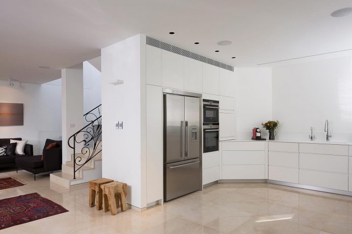
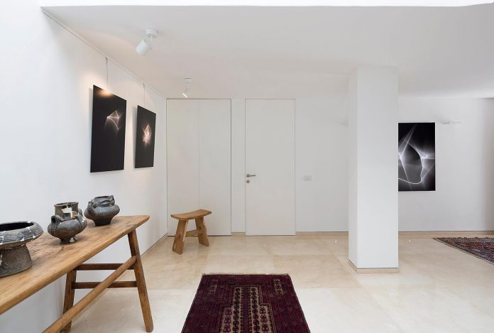
The walls are decorated with artistic photographs taken by the owners and the lighting can be adjusted to accommodate multiple photographs as reference to gallery spaces.

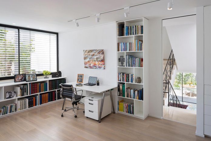
Further up the stairs is the work space that also doubles as a guest bedroom when the grandchildren come to visit. Prior to the renovation, this room was the master bedroom with an adjacent balcony. Merging the balcony with the room helped make it more functional in terms of size.
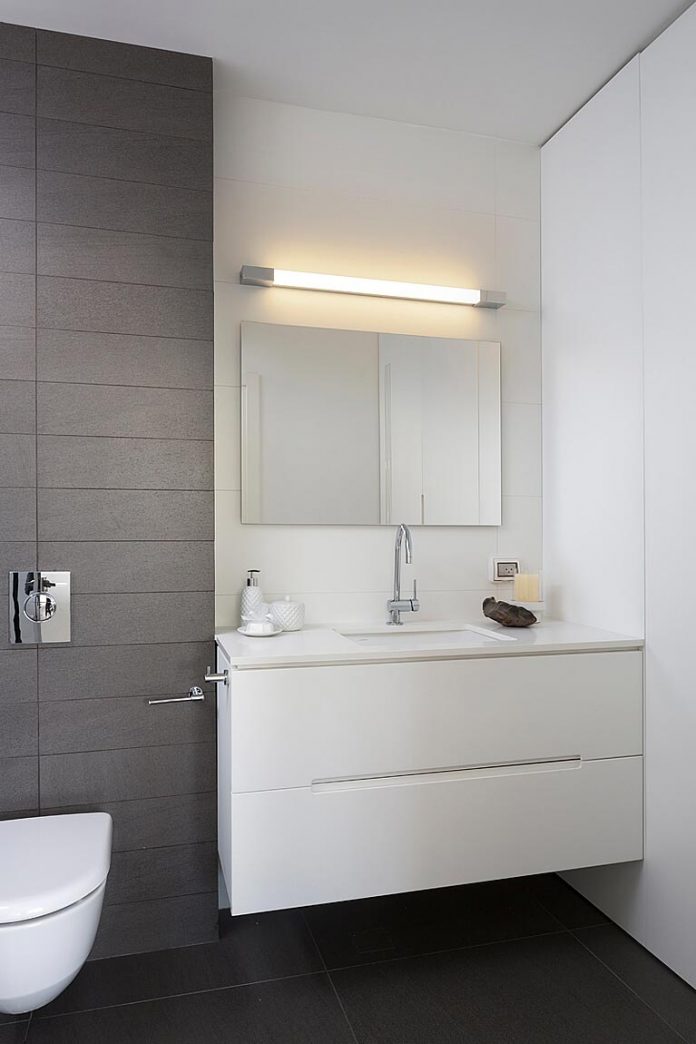
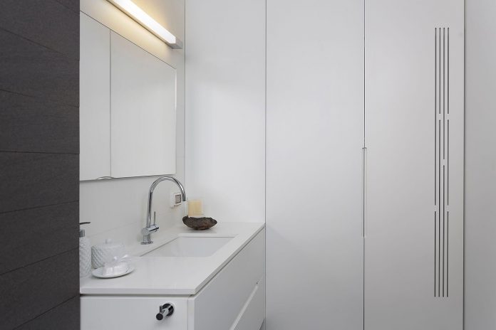
The bathroom was extended to fit a bathtub and a large closet neatly hides away the washer and dryer.
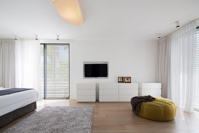
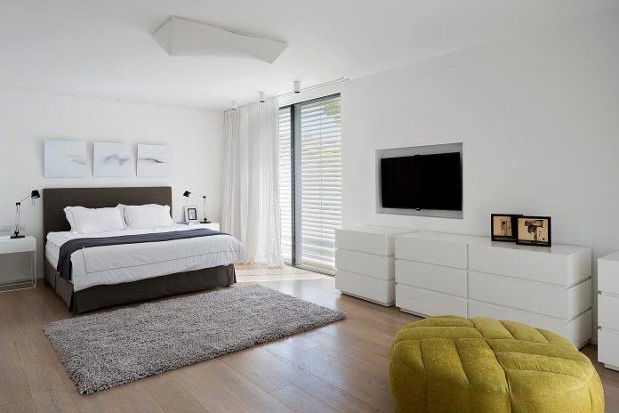
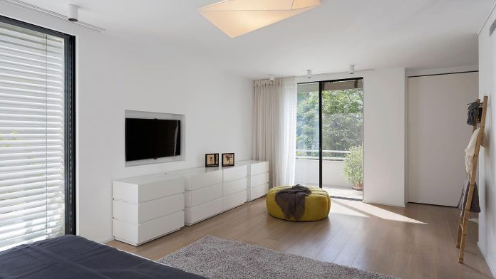
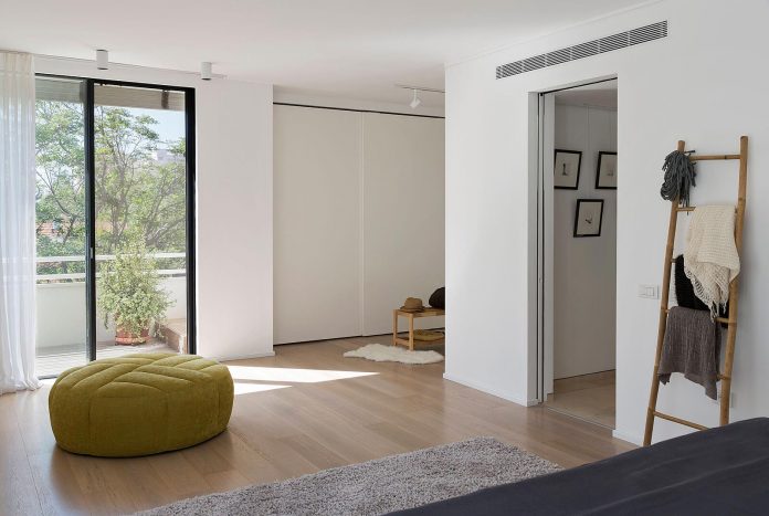
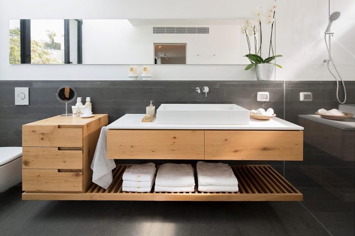
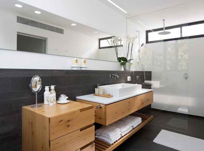
The top level has become a large and spacious master bedroom by removing all of the inner walls that made up three bedrooms. The walls were aligned to streamline the rectangular shape of the new rooms and there is now a foyer, with built-in closets on each side, that leads to the elongated master bathroom with window openings at both ends.
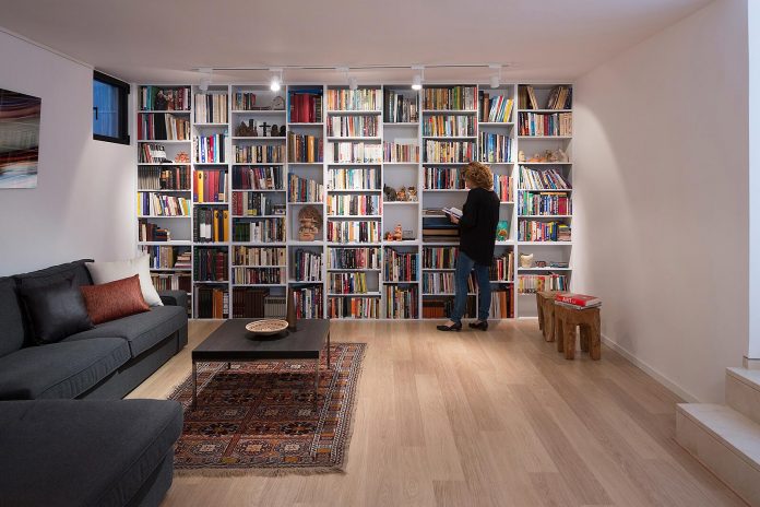
Below the main living space is the basement which features a focal wall with a floor to ceiling bookcase and a corner seating area.”

Thank you for reading this article!
沒有留言:
張貼留言