https://www.caandesign.com/bloomberg-wooden-hong-kong-office-nerihu-design-research-office/
Bloomberg Wooden Hong Kong Office by Neri&Hu Design and Research Office
Architects: Neri&Hu Design and Research Office
Location: Hong Kong
Year: 2015
Area: 2.885 ft²/ 268 m²
Photo courtesy: Neri&Hu Design and Research Office
Description:
Location: Hong Kong
Year: 2015
Area: 2.885 ft²/ 268 m²
Photo courtesy: Neri&Hu Design and Research Office
Description:
“Robin Evans’ 1978 essay Figures, Doors and Passages analyzes how ordinary elements of a plan and their arrangements interact and shape occupancy. A simple corner or window opening is in fact inscribed with a complex matrix of spatial relationships that determine how a space is used. Neri&Hu’s design for Bloomberg Hong Kong’s internal office stair is in part inspired by the mundane elements of space-making – windows, passages, staircases and thresholds.

The client’s brief was to design a staircase to connect the 3 different floors of their office with the explicit rule that this stair should to be used daily as the only vertical connection within the office to encourage employee interaction. Part of the brief was to also create a design that would respond to the locale of Hong Kong to create a link to the larger context of the city.

The site is situated in the client’s existing office, within a typical office tower and surrounded by existing conference rooms, break-out areas, a recording studio and an auditorium. The existing spiral staircase was sculpturally iconic but the geometry was not conducive for the daily high traffic volume. Our challenge was re-design a staircase that would work within the structural limitations of the knock-out panels in the floor slab, while still creating a more spacious journey.
Advertisement

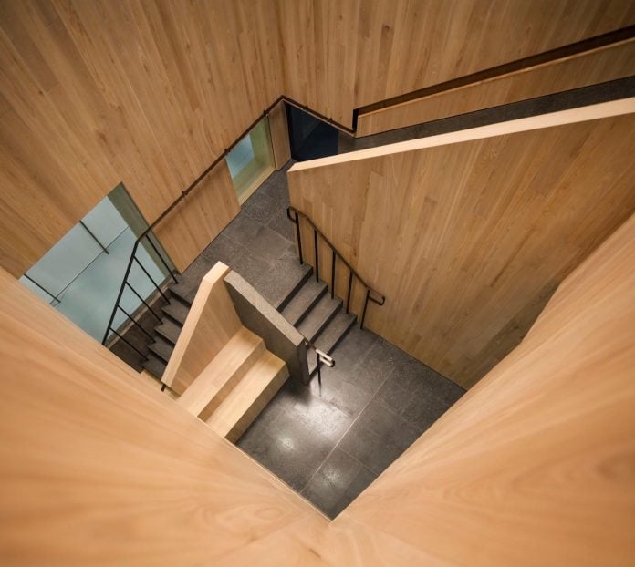
The new staircase integrates elements of platforms, landings, built-in seating and strategic window framing that echo what one may find in the extremes of Hong Kong’s natural landscape and urban terrain. Expressed as a wooden box insertion, the staircase massing actively denies the view to Victoria Harbor (a typically sought after and framed view in Hong Kong corporate offices) and instead focuses on framing activity within the office while still offering curated views out.

Enclosed in a light ash wood massing, with exposed fine aggregate concrete treads and bronze metal railing accents, the staircase winds and turns to offer unexpected views – through windows, up double height cuts, down large voids and across to surrounding programs. Recessed barrisol lighting was designed to mimic natural skylight cuts in the ceiling.

Each of the three levels is designed with different functions to accommodate a diverse set of vertical programs. The journey begins on the 25th floor reception, expressed as a carved niche with a window framing the harbor view beyond. This level is designed to be the most extroverted in nature with a large event space stage for gatherings, built in benches on the perimeter as well as dedicated areas for small break-out group seating.

The niche seating was also inspired in part by the break-out meeting pods that were displaced in the enlarged staircase scheme; rather than reinstating these as separate meeting spaces, we integrated functional seating and meeting areas into the architectural language of the staircase.

Upon closer interaction with the millwork, hidden bespoke details are revealed to the user within these seating niches – small wood and bronze panels fold out to reveal charging ports, mirrors, and functional ledges where a cup of coffee or cell phone may be placed – unexpected details in support of the ordinary rituals of daily office life.

Continuing up to the 26th floor, different views are framed along the circulation path. Given that the Bloomberg recording studio is located on this level along with conference rooms, the idea was to create a more introverted space to address issues of acoustic containment and visual privacy. The mass is split into two boxes, allowing the landing to become the threshold zone that visually opens up to the harbor view along the curtain wall on one side and linked to a passage to the conference rooms on the other.

The visual framing also satisfied the client’s request to provide a controlled glimpse or “borrowed scene” of the activated staircase from the recording studio as a filming background. In consideration of the more quiet nature of this floor, built-in seating facing the harbor view side is provided for solitary respite.

On the final level of the 27th floor, the staircase opens up again to be more extroverted to bring in views of the surroundings. The massing is reduced further in scale, punctuated with larger openings and clear glass to provide expansive views. A cantilevered viewing podium is designed as part of the auditorium break-out space to provide dramatic views down the multiple levels and the journey culminates in a lounge facing the harbor view.

Through careful composition and juxtaposition, the ordinary vignettes we take for granted on a daily basis, especially in an office typology, are choreographed into a rich journey that allows for moments of chance encounters, of pause and informal conversations.”


Thank you for reading this article!
沒有留言:
張貼留言