https://www.caandesign.com/mercat-amsterdam-by-concrete-architectural-associates/
Mercat Amsterdam by Concrete Architectural Associates
Location: Oostelijke Handelskade 4, Amsterdam, The Netherlands
Project team: Rob Wagemans,Ulrike Lehner, Charlotte Key, Femke Zumbrink (graphic design), Erik van Dillen, Bart de Beer
Fixed furniture : roord binnenbouw, amsterdam, nl
 Photos © by Ewout Huibers for Concrete
Loose furniture:
1. new: satelliet, amsterdam, nl
2. vintage: quip&co, putten, bloodnewlabel, haarlem
Special features: Neon letters by Seletti
Lighting: Oldwood, Midwoud
Metal constructions :Smederij van Rijn, Hazerswoude Rijndijk
Total area: 320 m2 + 230 m2 (terrace)
Opening: 9 september 2012
Photos © by Ewout Huibers for Concrete
DESIGN STORY / NARRATIVE
Mercat, the ninth member of the IQ family, is the Spanish sister of the Italian orientated Mazzo and French brasserie Witteveen. Similar to Mazzo and Witteveen, Mercat is a place where guests are welcome to eat drink and enjoy the whole day long. Besides the diverse cuisines, the location of the venue is one of the most significant differences between the three restaurants. Witteveen is situated in the vibrant Pijp area, Mazzo in the world famous Jordaan quarter, Mercat is located in the upcoming eastern harbor area, in a former harbor authority building.
Photos © by Ewout Huibers for Concrete
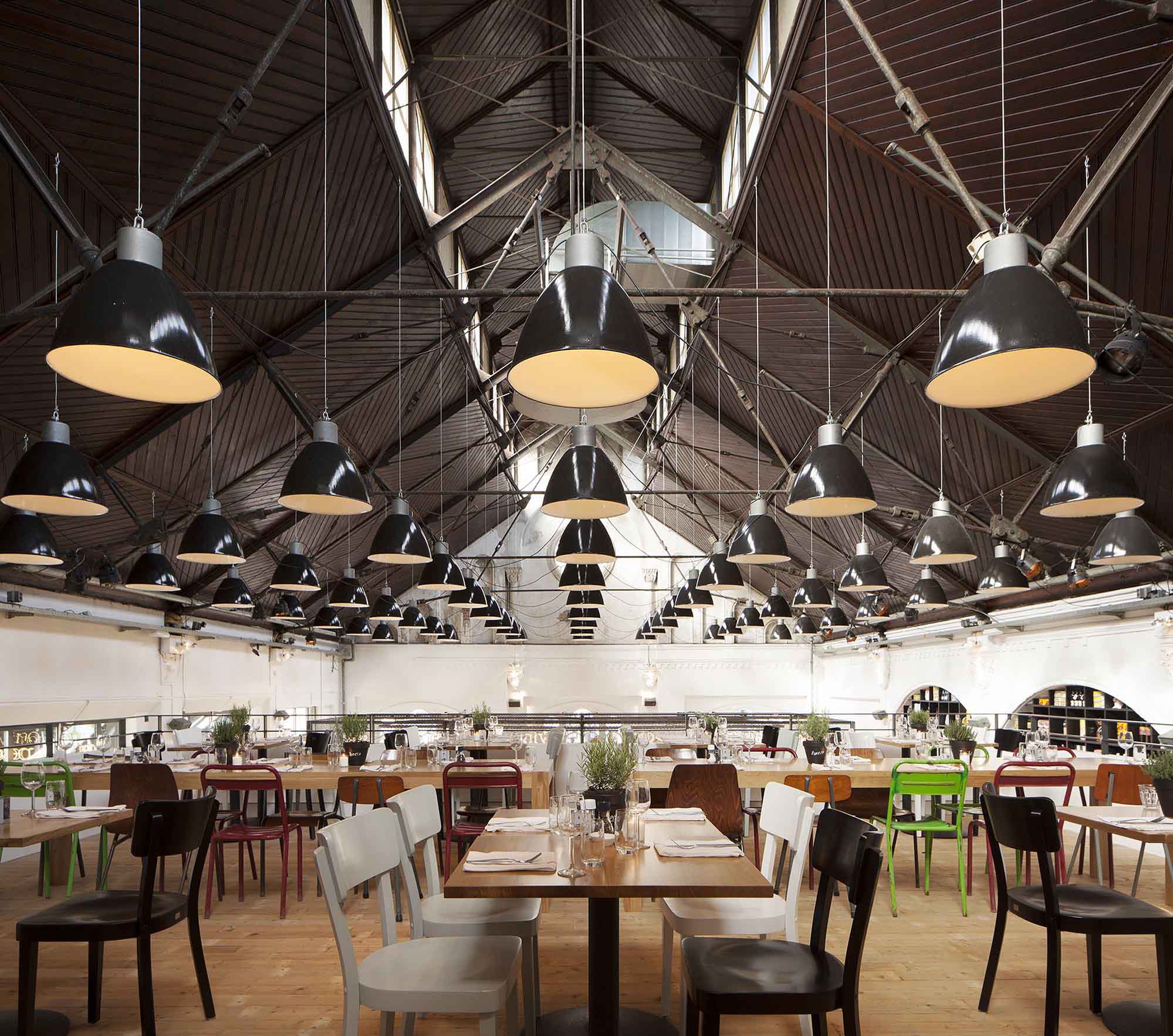
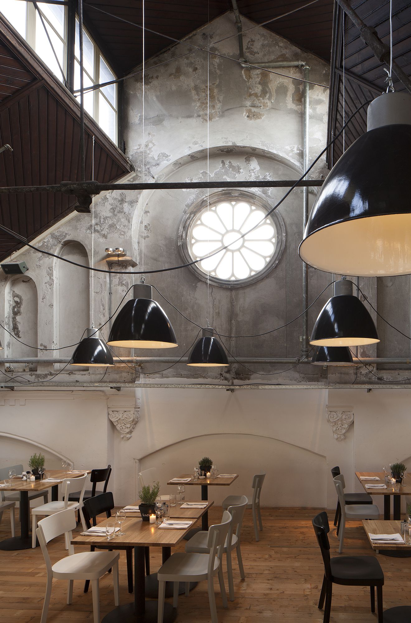
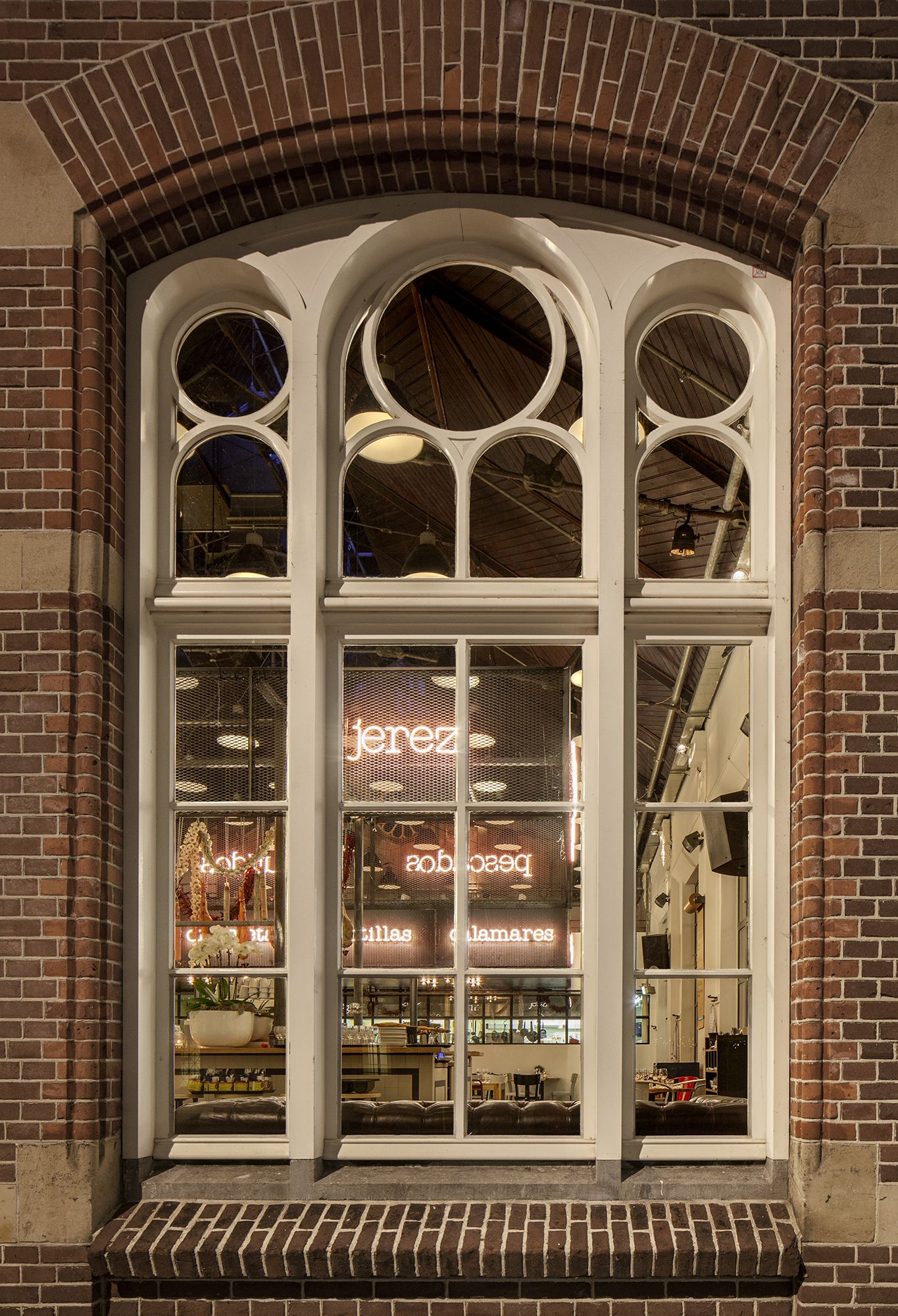
The exterior of the impressive building symbolizes the industrial heritage of the city of Amsterdam, the interior however refers more to a Spanish market hall, like Mercado Central de Valencia. The front- and back façade, with circular windows, the original wooden gabled roof showing the steel trusses, vertical skylights and brickwork walls with plastered decorations give the building character.
Advertisement
The similarities between the characteristic building and market halls, together with tops-chefs referring to Spanish market halls as ‘gastronomic temples’, were the starting point for the design and concept for the restaurant Mercat. Mercat is the Catalan word for market and links to the famous ‘Mercat de La Boqueria’ in Barcelona.
Photos © by Ewout Huibers for Concrete
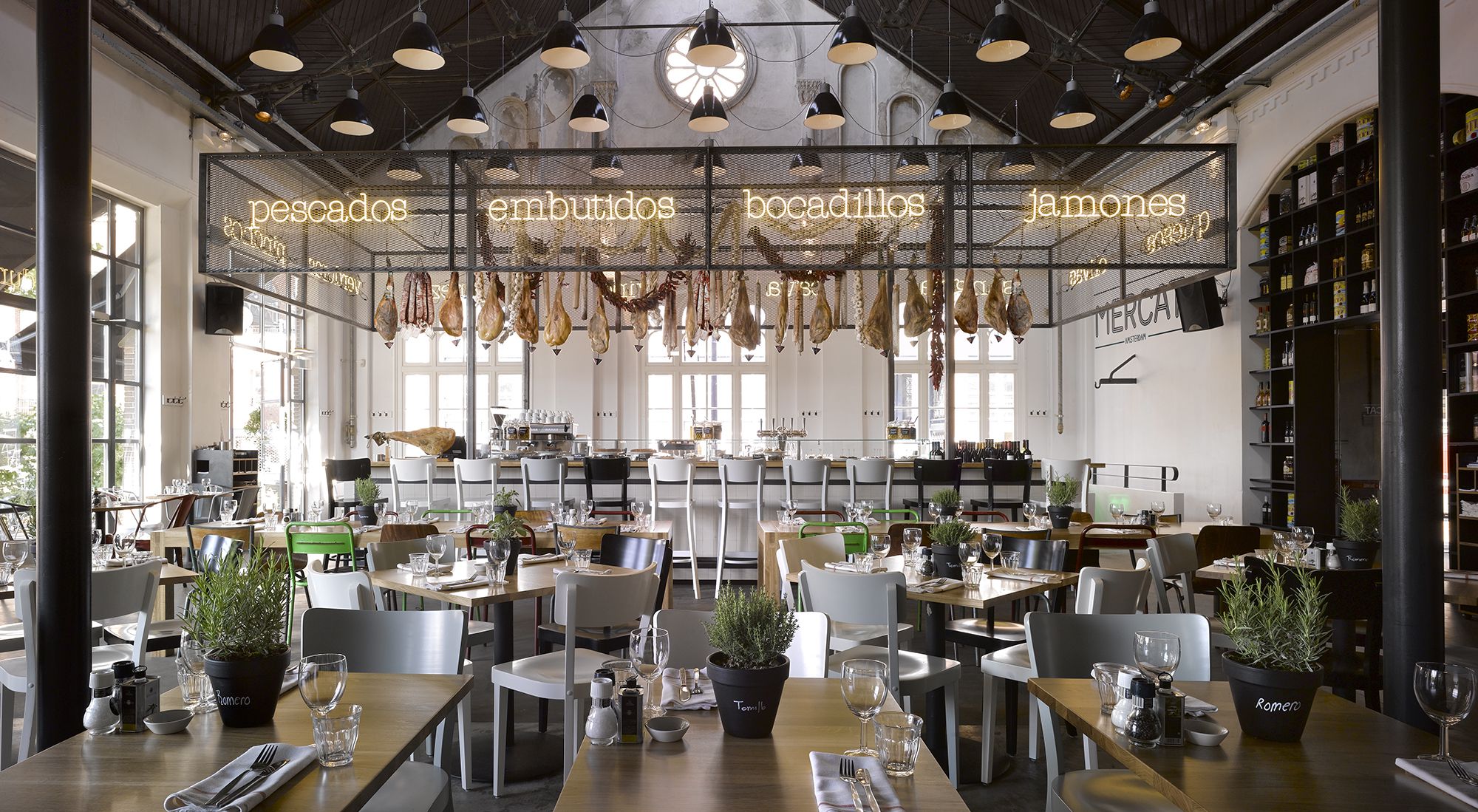
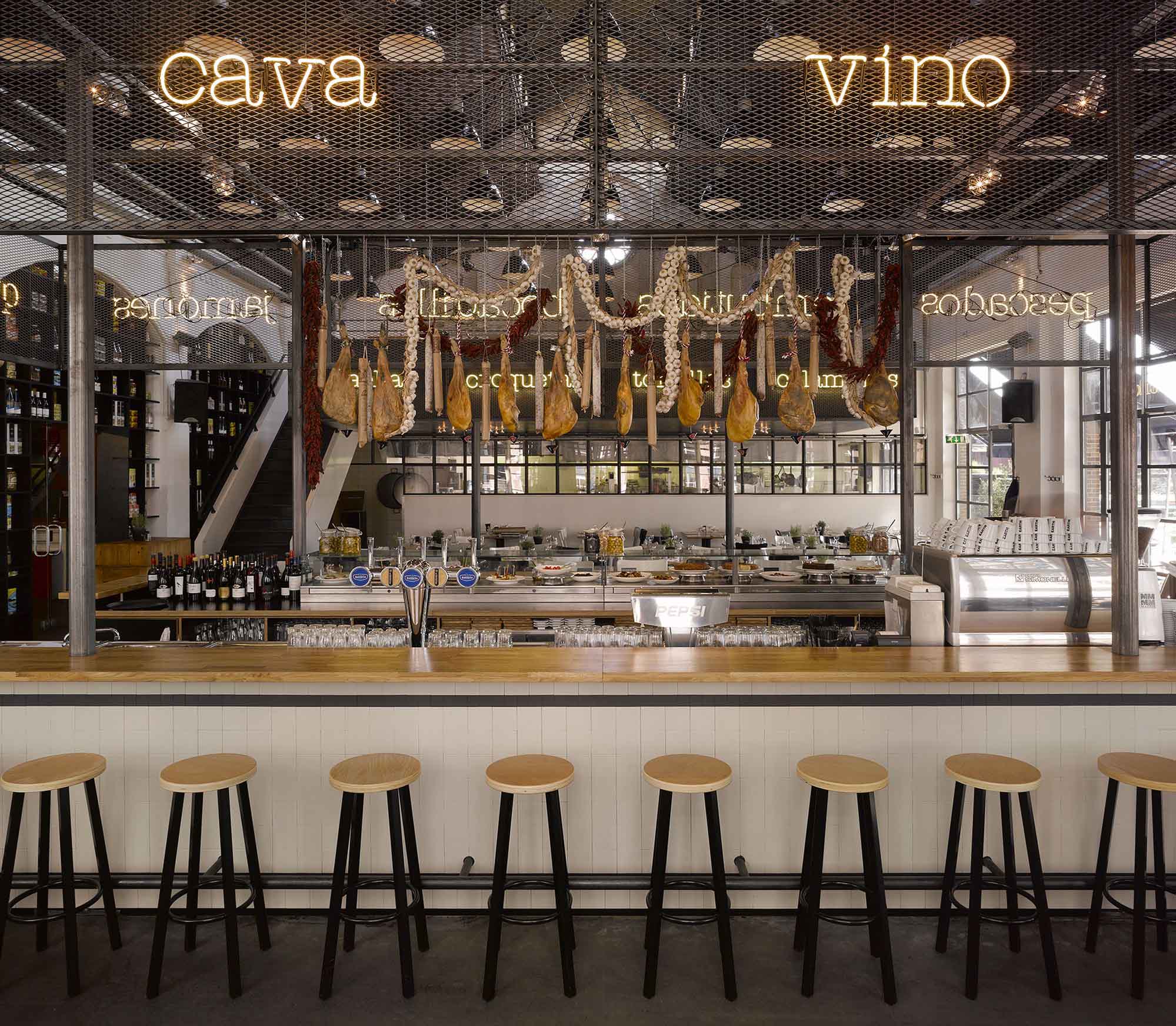
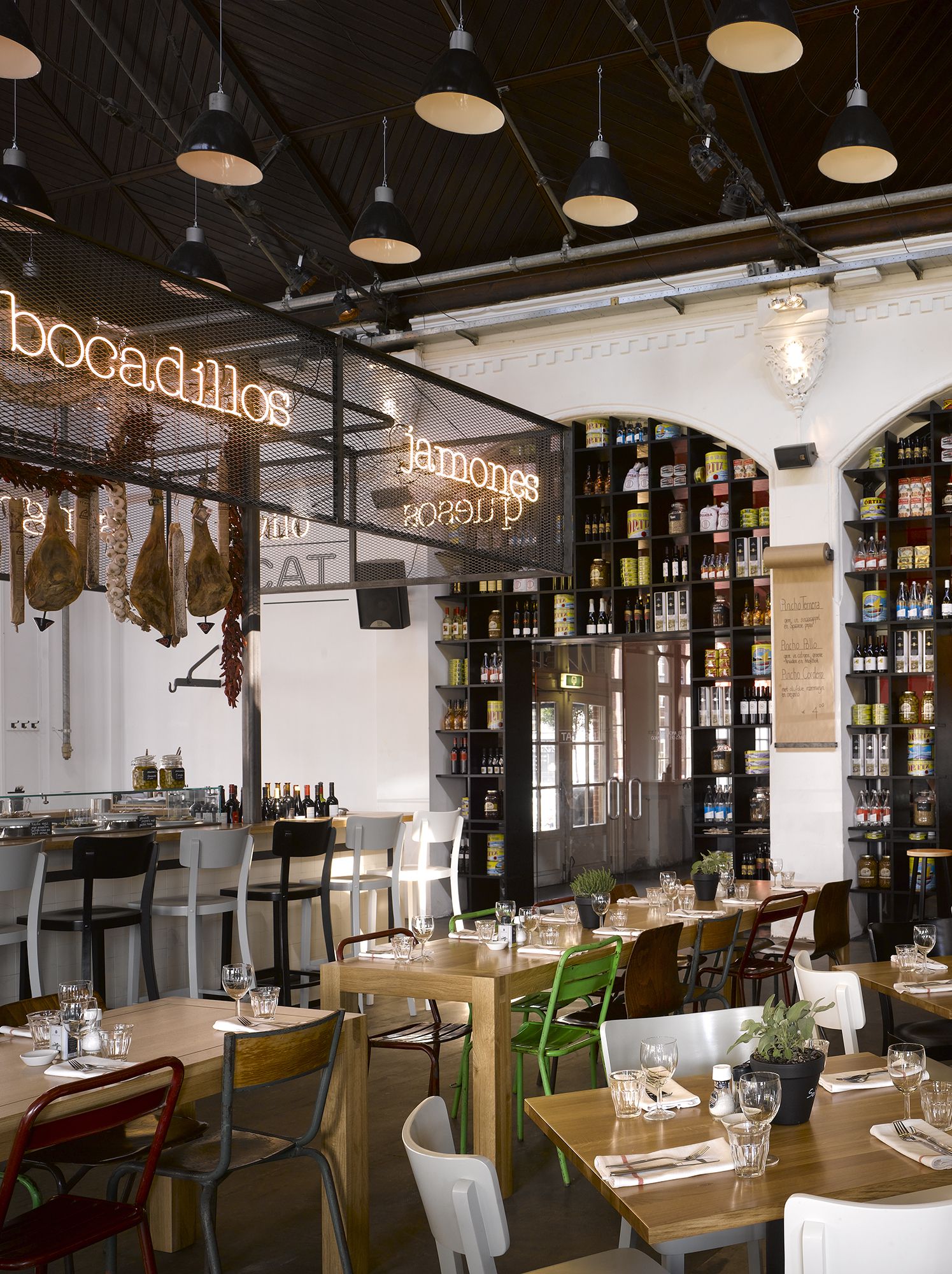
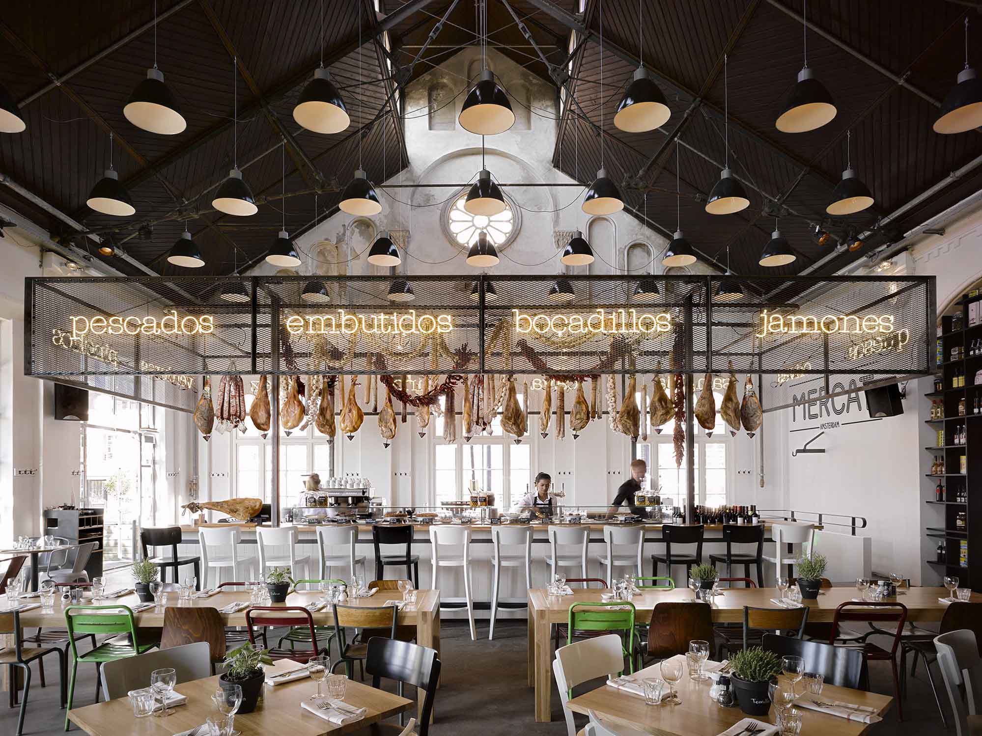
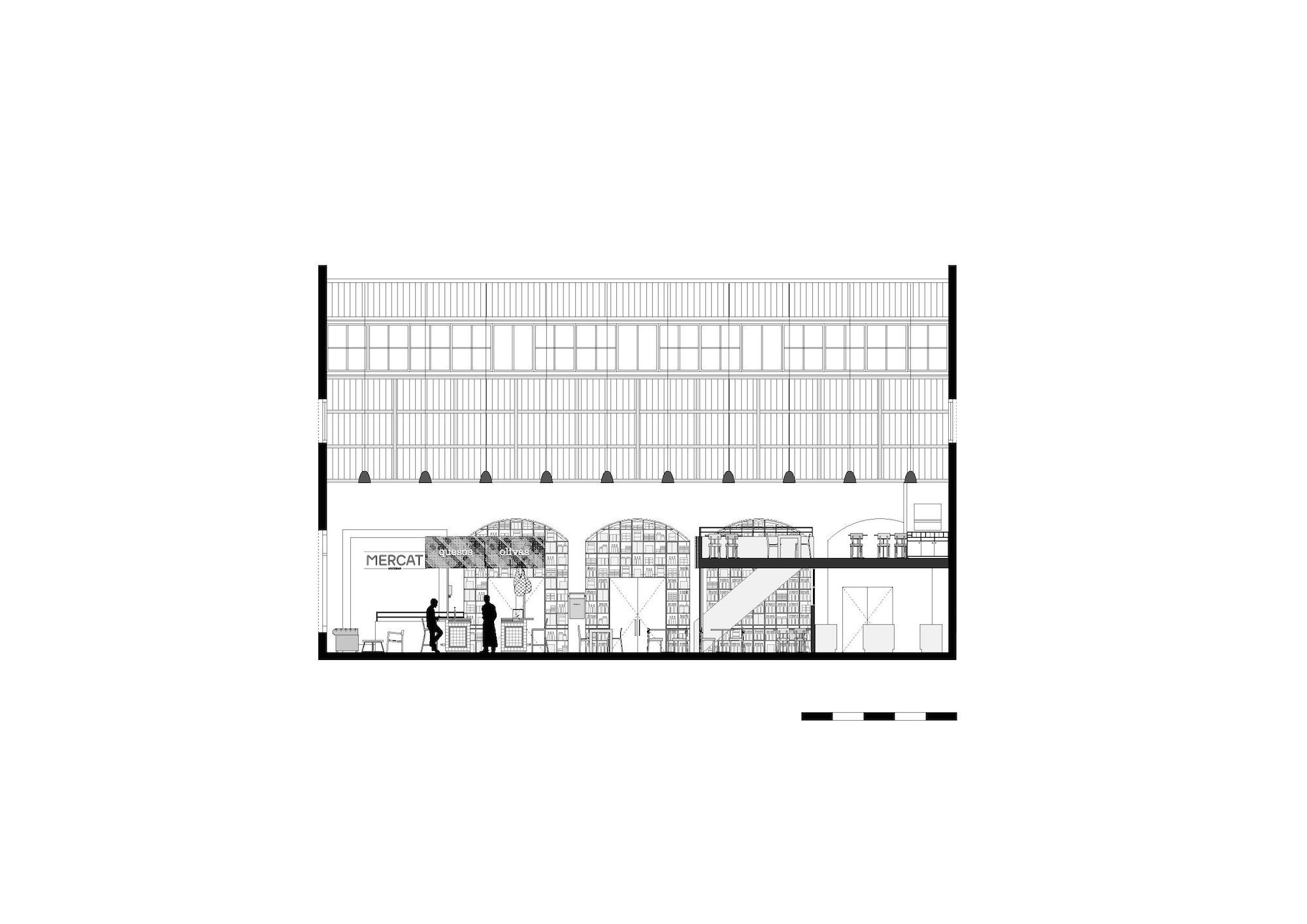
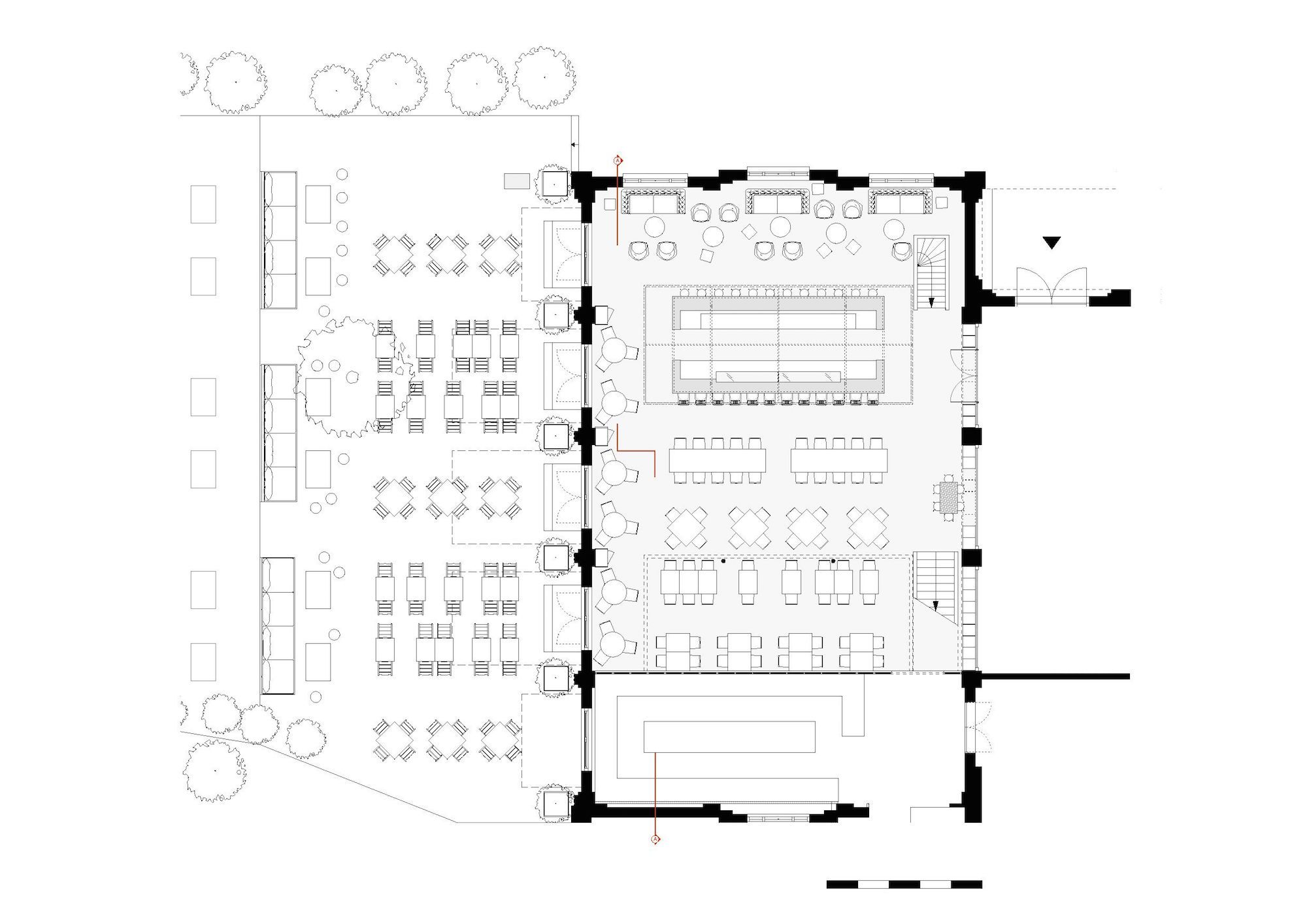
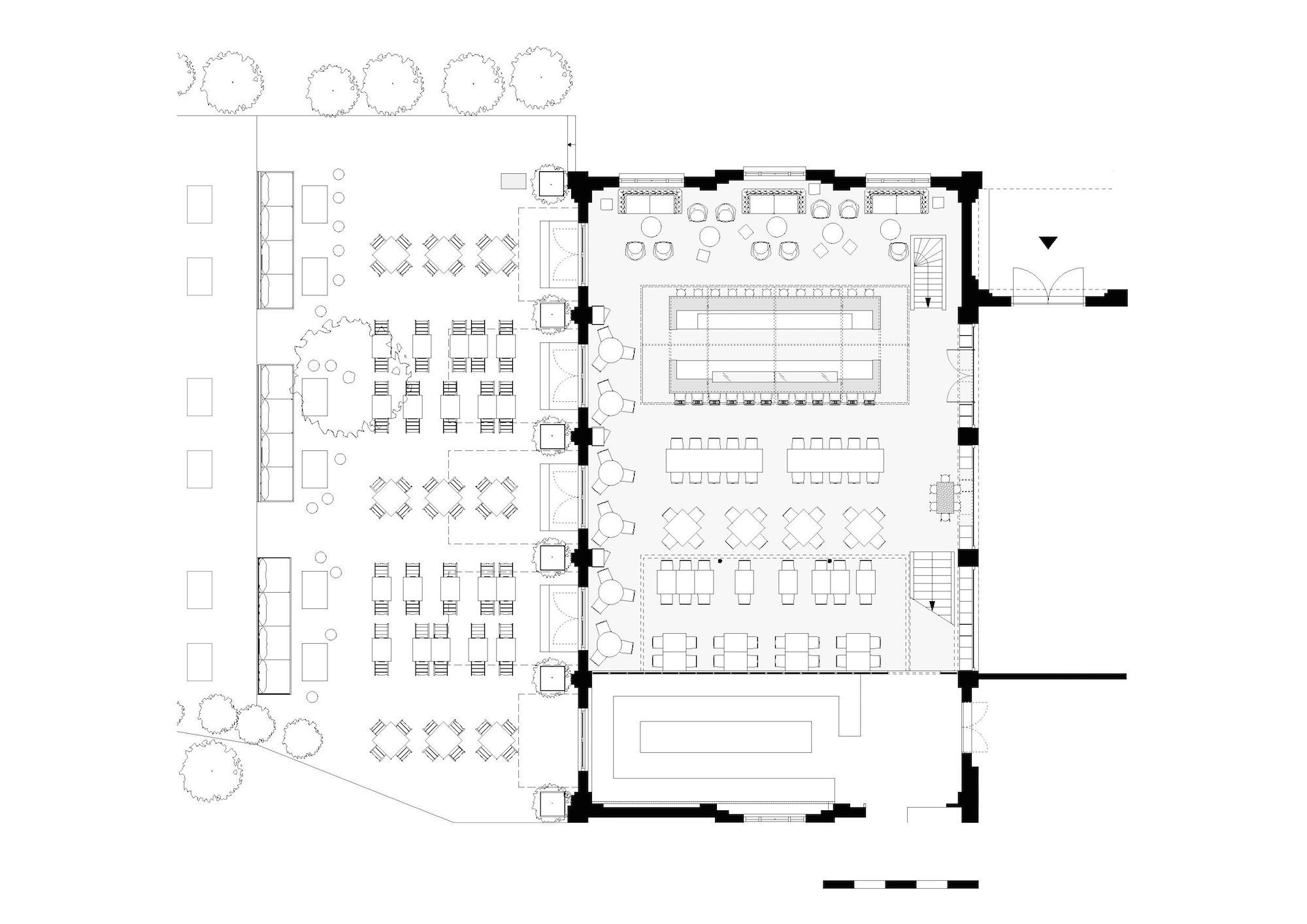
A market hall comes to life through the many stalls presenting the numerous fresh products. The central element within the interior design of Mercat are two large stalls. The freestanding stall, positioned on the street side of the building, functions as a drinks and foodbar. The second stall, adjoining the kitchen, forms a mezzanine with an extra ting area looking over the market hall. The stall image is created by a slim designed raw steel construction. The steel framed roof of the stall is wrapped in a metal mesh, that offers intimacy to the guests at the bar and provides the possibility to hang typical Spanish products; Serano hams, Chorizos, garlic strings and red peppers. The colourful signing typical for market stalls is abstracted to neon lettering from Seletti. The white neon letters form words like bocadillos, jamones and tortillas; all dishes and products available from the Mercat menu. The mezzanine, the roof of the second market stall, is also wrapped in a metal mesh and decorated with Spanish words in neon letters. A more intimate ting area is situated underneath the mezzanine; where guests, through a window, can experience the dynamics of the kitchen.
Photos © by Ewout Huibers for Concrete
The free standing bar is a combination of a drinks and food bar. The round bar stools on the street side (wood and black metal) invite guests to sit down at the bar for a fast espresso or a final drink after diner. The ting area, next to the windows, is designed in the same atmosphere. Three chesterfields sofa’s, low chairs and tables offer a living room feel. The other side of the bar is devoted to food and dining. The four meter glass case displays different cold dishes, like tapas and pincho’s. Wooden barstools offer guests a place to eat at the bar, like the Spanish do. The bar is tiled with black and white Winckelmans tiles, in two different sizes, referring to the regular use of tiles in Spanish culture. The oak bar top gives a warm atmosphere to the whole and connects to the tables at the same time. The tables have an oak top to give guests the feeling of sitting at a cosy kitchen table.
A wide variety of new and second hand chairs, made of wood or metal, symbolise the diversity and chaos of the Spanish market halls. In addition the selected products enhance the market feel and organised chaos; sardine cans, bottles with olive oil, preserving cans with lentils, all of Spanish origin are presented in three open cabinets placed under the arced passages. The stained black plywood cabinets are a transparent separation between the entrance lobby and the restaurant. The products are visible from both sides and the glass entrance door to the restaurant is incorporated into one of the cabinets. Every guest enters the restaurant by stepping through a wall of Spanish products.
Photos © by Ewout Huibers for Concrete
Typical for a marketplace is the use of industrial suspended lighting. A grid of 70 black metal lights form the basic light plan of the restaurant and create an optically lower ceiling at the same time. The lights enhance the intimacy of the ting area on the mezzanine.
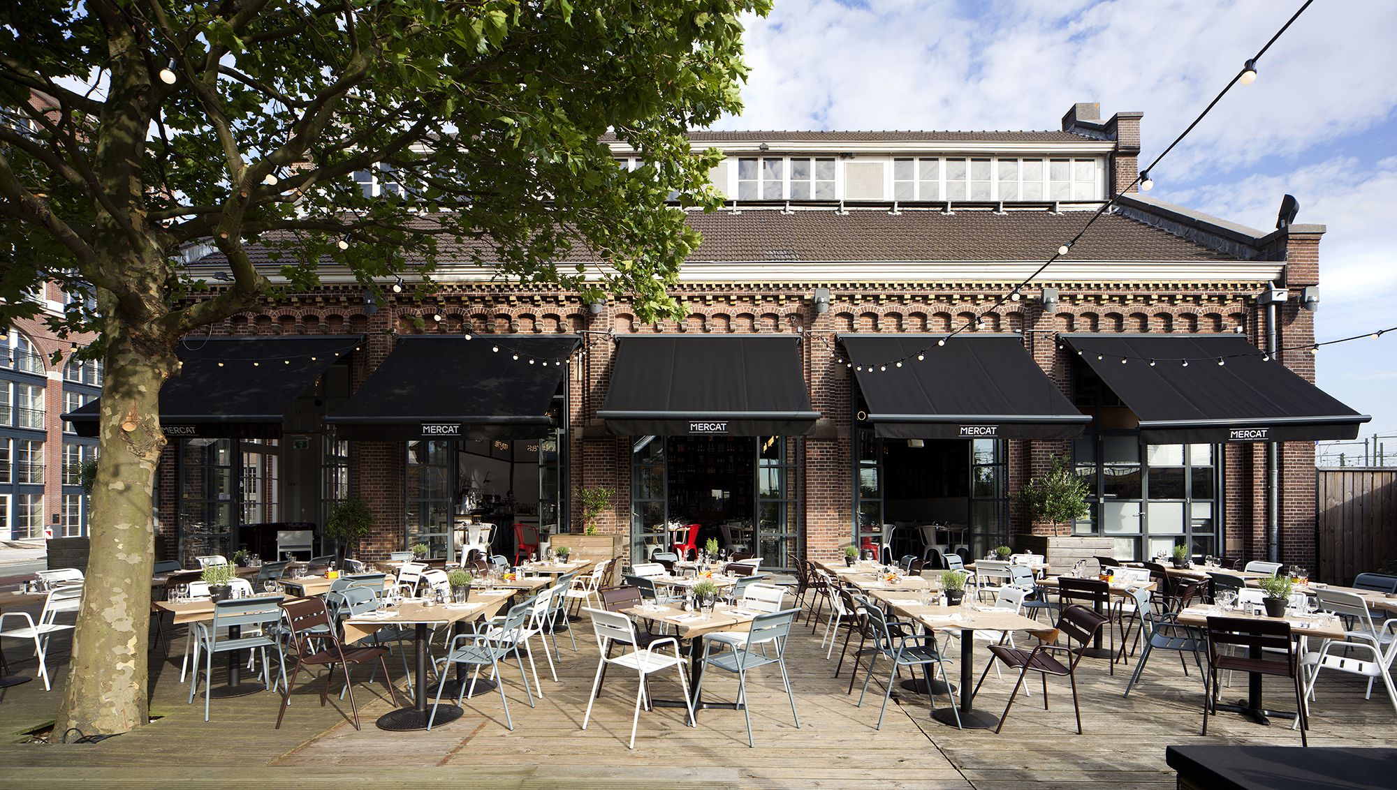
A big sunny terrace is open for guests during summer. Inside and outside melt together when a series of 3,5 meter high doors open up on the west façade of the building. The diversity of the market hall is expanded to the outside terrace. Guests can sit down on different coloured of terrace furniture on the wooden deck, a picnic couch or a simple rug on the grass in the shade of the trees. When ordering a ‘Mercat picnic basket’, this piece of land can feel very Spanish. If the Dutch weather allows it the terrace can be transformed into a vibrant night scene after sunset, with ambient lighting from 100 light bulbs.
Photos © by Ewout Huibers for Concrete
VISUAL IDENTITY
The visual identity is a result of the raw, honest interior and characterics of a spanish market hall. By using clear shapes, grids and high contrast black-and-white images, similar to Mazzo and Witteveen, a distinct graphic identity is created.
The foundation of the Mercat corporate identity is the Helvetica font, recognizable in every project of the IQ creative family. The font has been adjusted by abstracting the outlines of “MERCAT” and given a characteristic interpretation in neon tubes, referring to the neon lights on the Spanish market stalls. Next to the neon signs, chalkboards are used on Spanish markets to promote daily specials. In “Mercat” you can find this form of communication in the handwritten font.
Menu
Referring to the advertising boards of a market, the menu is clamped on a clipboard. By using three separate A4 pages the menu is clearly divided in menu/wine menu/children’s menu and is easy adjustable to sonal dishes. For the kids there is a special “maze puzzle menu”, a link to the neon tubes in the logo and the neon signs on the market stalls. The menu of the day is presented on huge rolls of brown wrapping paper which are placed above the two service stations.
The corporate identity, is present in the interior through signing and window stickers.
Cabinets
The cabinets define a great part of the ambiance of the restaurant, giving colour to the space and therefore playing an important part in the visual identity of Mercat. The cabinets are filled with different products of Spanish origin: sardine cans, bottles of wine, preserving cans with lentils, cans of olive oil and rice bags. The characteristic packaging of the products creates a colourful and Spanish flair.
Website
The binding element in the restaurant, the Spanish market stalls with neon signs, serve as the template for the Mercat website. The neon signs “pescados”, ”embutidos” “boccadillos” and “jamones” are changed in “mercat”, “menu”, “pictures” and “location”. As the controversial floor has modelled for the website of Witteveen, the cupboard filled with products is the main element of the Mazzo website.
Photos © by Ewout Huibers for Concrete
FACTS & MATERIALS PUBLIC SPACES: Floor – Wall – Ceiling – Lighting – Furniture
Item
Floor:
1.power floated concrete
2. used roof panels, deal wood – www.komu.nl
Walls
1.plastered and painted, white
Ceiling
1.existing wooden ceiling boarding
2. steel trusses
Lighting
1.industrial suspended lights, ø 53 cm, black exterior– www.oldwood.nl
2.adjustable spots QR002, 2x halogen AR 111, aluminium – www.illum.nl
3.neon letters – www.seletti.it
Furniture
1.chair 350 SC, black/white/light grey stained wood – www.satelliet.nl
2.bar stool 350 HS, black/white/light grey stained wood – www.satelliet.nl
3.bar stool ron, wood with black metal undercarriage – www.buroenzo.nl
4.diverse chairs, second hand – www.bloodnewlabel.nl, www.quip-co.nl
5.monceau arm chair, white/dark grey/dark brown – www.fermob.com
6.table viking, oak – www.satelliet.nl
7.table tops, oak – www.satelliet.nl
8.chesterfield couches, brown leather – second hand
Drawing © Concrete
Drawing © by Concrete
Drawing © Concrete
沒有留言:
張貼留言