https://www.weforum.org/agenda/2018/10/the-80-trillion-world-economy-in-one-chart
The world's $80 trillion economy - in one chart

Ten economies combine for a whopping two-thirds of global GDP.
Image: REUTERS/Kim Kyung-Hoon - RC1980EACE60
This article is written in collaboration withVisual Capitalist
15 Oct 2018
The latest estimate from the World Bank puts global GDP at roughly $80 trillion in nominal terms for 2017.
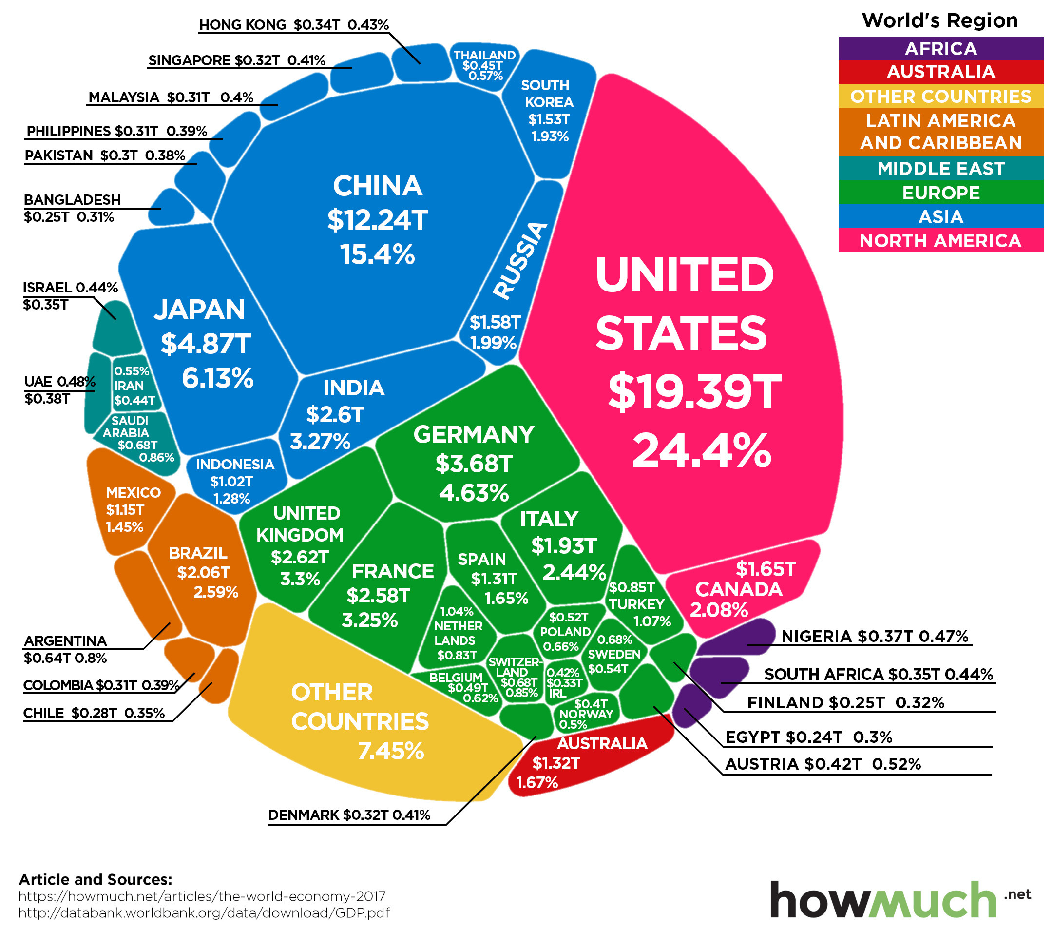
Today’s chart from HowMuch.net uses this data to show all major economies in a visualization called a Voronoi diagram – let’s dive into the stats to learn more.
The world's top 10 economies
Here are the world’s top 10 economies, which together combine for a whopping two-thirds of global GDP.

Image: howmuch.net via Visual Capitalist
In nominal terms, the US still has the largest GDP at $19.4 trillion, making up 24.4% of the world economy.
While China’s economy is far behind in nominal terms at $12.2 trillion, you may recall that the Chinese economy has been the world’s largest when adjusted for purchasing power parity (PPP) since 2016.
The next two largest economies are Japan ($4.9 trillion) and Germany ($4.6 trillion) – and when added to the U.S. and China, the top four economies combined account for over 50% of the world economy.
Have you read?
Movers and shakers
Over recent years, the list of top economies hasn’t changed much – and in a similar visualization we posted 18 months ago, the four aforementioned top economies all fell in the exact same order.
However, look outside of these incumbents, and you’ll see that the major forcesshaping the future of the global economy are in full swing, especially when it comes to emerging markets.
Here are some of the most important movements:
India has now passed France in nominal terms with a $2.6 trillion economy, which is about 3.3% of the global total. In the most recent quarter, Indian GDP growth saw its highest growth rate in two years at about 8.2%.
Brazil, despite its very recent economic woes, surpassed Italy in GDP rankings to take the #8 spot overall.
Turkey has surpassed The Netherlands to become the world’s 17th largest economy, and Saudi Arabia has jumped past Switzerland to claim the 19th spot.
Share


沒有留言:
張貼留言